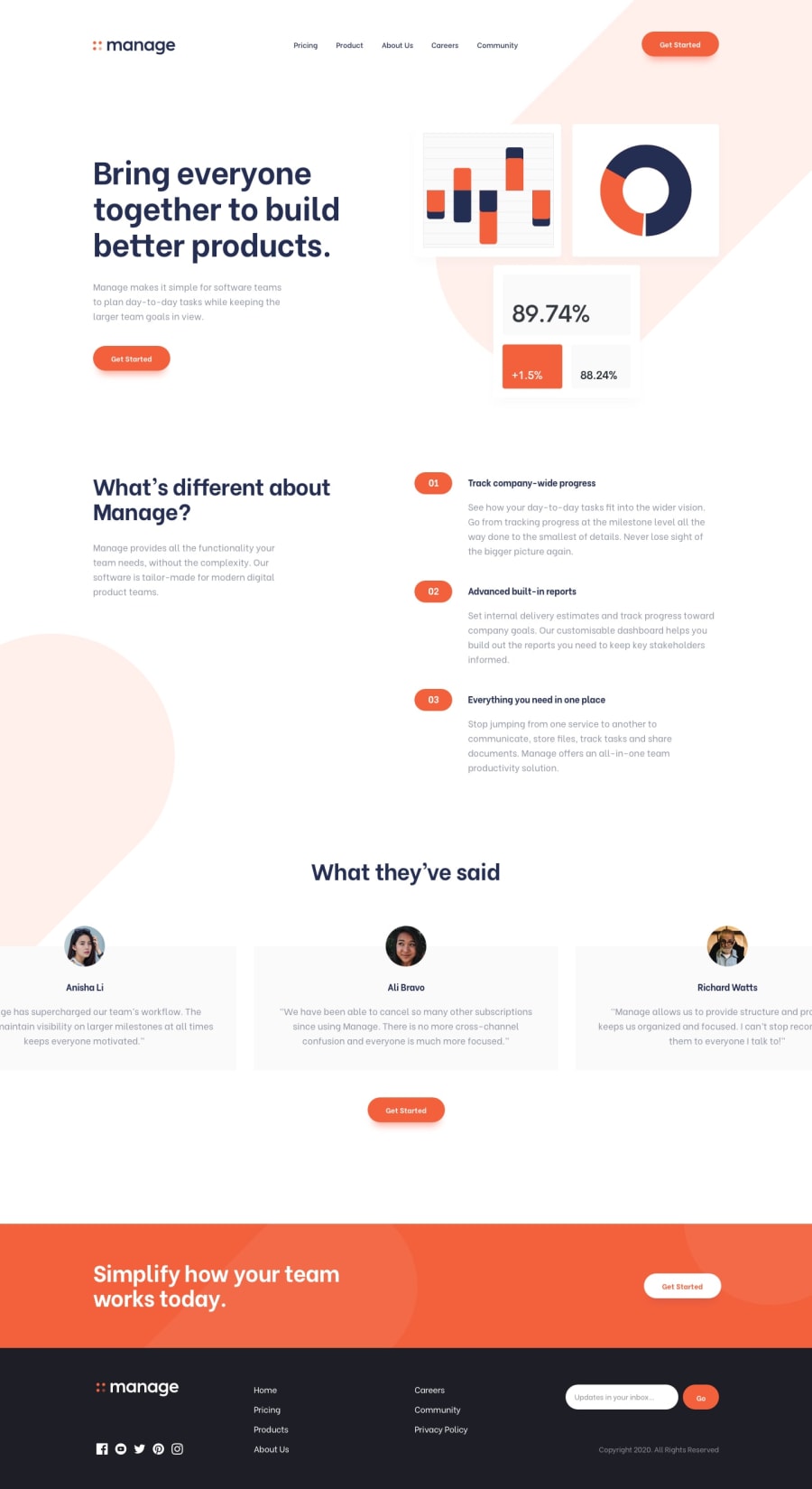
Vue.js Manage Landing Page with Horizontal Scroller
Design comparison
Solution retrospective
Any feedback is appreciated! :)
The initial problem I've noticed is with resizing the window as the navigation menu sometimes opens by default on mobile view.
UPDATE: The initial problem is fixed and it was pointed out to me there was some horizontal overflow, so that's fixed as well. Additionally, I've implemented a breakpoint for tablets also due to too large icons.
Community feedback
- @codeswithrohPosted over 3 years ago
You did a great job regarding this solutions. Well, there are a few things that needs to be addressed.
-
As you told there is that problem with your navbar which pops suddenly during the change in screen size
-
There is a horizontal scroll which is a bit annoying
-
I would suggest you not to set style inside the tags itself because it causes problems
-
Your site looks good for screen sizes beyond 1440px but most of the user will view this site in 1440px and for 1440px the icons are a bit bigger.
Except these you did an awesome job. So, keep coding 😊
1@sofskrbicPosted over 3 years ago@codeswithroh Thank you for your feedback! 😊
I didn't even notice the horizontal scroll on screens below 1440px, thanks for pointing that out! I will fix these issues as soon as possible
0 -
Please log in to post a comment
Log in with GitHubJoin our Discord community
Join thousands of Frontend Mentor community members taking the challenges, sharing resources, helping each other, and chatting about all things front-end!
Join our Discord
