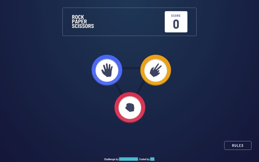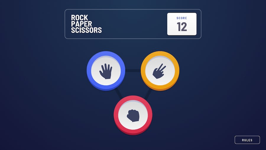
Design comparison
SolutionDesign
Solution retrospective
How can I improve my design to be more flexible?
Community feedback
- @tripn11Posted over 1 year ago
Your design is really beatiful, i love it... How did you create the radial shades around the winner. There are about 5 radial shades that form around the winner of each round. How did you do it?
1@halivertPosted over 1 year ago@tripn11 Thank you 🙏🏽, I've used 3 different box-shadows:
.waves {
--opacity: 0.03;

box-shadow: 0 0 3px 20px rgba(255, 255, 255, var(--opacity)),
0 0 3px 50px rgba(255, 255, 255, var(--opacity)),
0 0 3px 85px rgba(255, 255, 255, var(--opacity));
}
Each shadow is behind the others, so that's why the opacity is so small, then we provide the spread radius (4 value: 20px, 50px and 85px) to grow every shape
0
Please log in to post a comment
Log in with GitHubJoin our Discord community
Join thousands of Frontend Mentor community members taking the challenges, sharing resources, helping each other, and chatting about all things front-end!
Join our Discord
