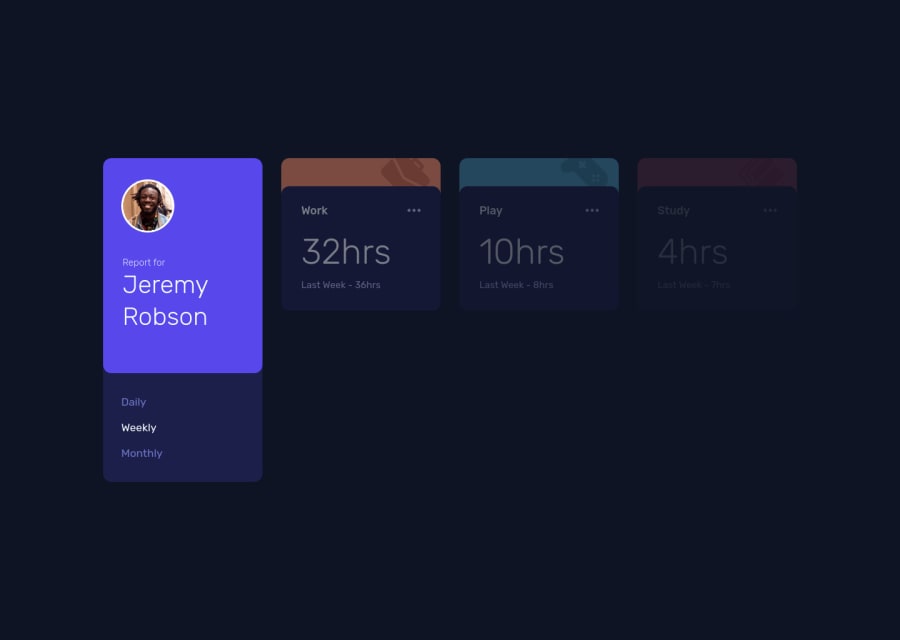
Vue3, Pug, Sass, Typescript, Vite - Time tracking dashboard page
Design comparison
Solution retrospective
I know the tab switching state change and tablet version of the site is kinda odd, but I figured if I don't publish this now, I would try to make it "perfect" and in the end what will happen is that after a lot of days the only thing that'll change would be some pixel values and some other tiny unimportant stuff.
-
This was my first time using an experimental feature of Vue, the
ref sugar. Which is, if you know the Composition API in Vue, it helps us use thereflikereactive. i.e. the.valuecan be omitted by changingrefinto$refand additionally, it doesn't need to be imported. -
I learned the trade-offs of using experimental features because a lot of the time the site deployment failed because of some package's patch or version updated.
-
Instead of using the Composition API
setupfunction in thescript, I usedscript setupwhich will drastically reduce the boilerplate code and gives clear distinction between Options api and Composition api code. -
One additional thing I added is, the tab's active state will be stored in localStorage. So, even after refresh, it'll have the same active state. Also, I tried to make it responsive to smaller devices.
-
Most of the time when I use Vue cli, my laptop gets laggy, but since I used Vite to scaffold the project, it was a smoother and 'non-laggy' experience. I'll certainly use it in the future projects.
-
Things I've learned while doing this challenge are in the README.md btw.
I'd love to hear your feedbacks and criticisms on my take 😀
Community feedback
Please log in to post a comment
Log in with GitHubJoin our Discord community
Join thousands of Frontend Mentor community members taking the challenges, sharing resources, helping each other, and chatting about all things front-end!
Join our Discord
