Design comparison
SolutionDesign
Solution retrospective
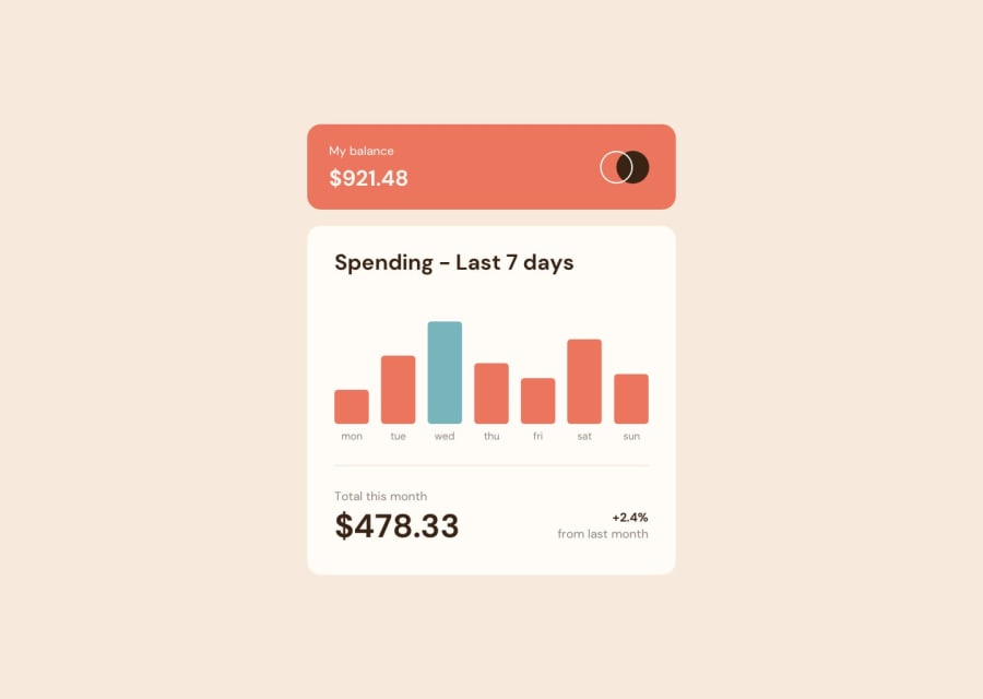
Vue solution abusing slots. Used grid instead of flex on the chart itself because I designed it last (so I had I knew the height it had to be ahead of time).
Questions: Any feedback on how to modify the size of the svg while keeping the aspect ratio? I literally just modified the height and width which didn't exactly give the results I wanted.
Community feedback
- @sinjin25Posted over 2 years ago
Oh man I didn't actually finish. How do I delete this :(
EDIT: decent attempt after finishing the desktop version.
- double border-radius on card elements
- svg size is off
- "my balance" font-size slightly too large (use padding/margin instead)
- bottom-right text slightly too big; use padding to reduce the height of the div instead
- bar labels slightly too small
- add a tiny bit more padding on the bars so they're slimmer
0
Please log in to post a comment
Log in with GitHubJoin our Discord community
Join thousands of Frontend Mentor community members taking the challenges, sharing resources, helping each other, and chatting about all things front-end!
Join our Discord
