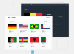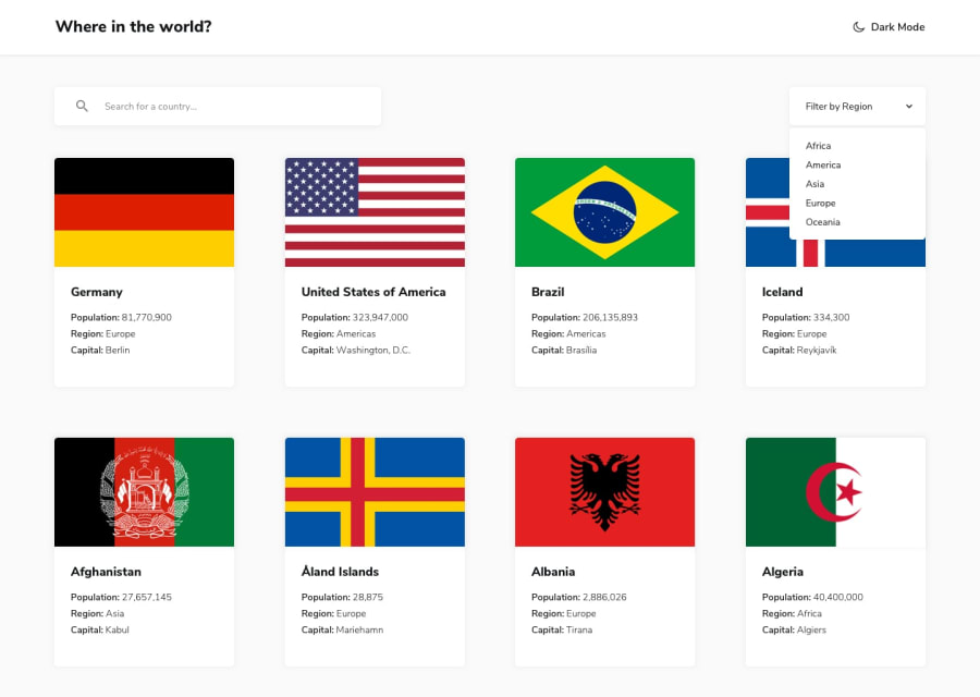
Design comparison
Solution retrospective
I would appreciate any feedback on this project. Thank you.
Community feedback
- @shubhamthedevPosted over 4 years ago
Hi, awesome job on the project here's what i think you can improve:
-
First of all the icons in the search and filter regions aren't visible for some reason.
-
Second when you toggle dark mode on the homepage, it persists only until i click on the neighbouring borders of a specified country i.e. if i clicked on India the dark mode persists but as soon as i click on one of it's borders it disappears.
-
Third you are loading some wrong pages like for ex. when i clicked on India it opened up British Indian Ocean territories page, maybe you're making the wrong api requests.
Here is mine solution although i did it using React.
Hope this helps 😊
1 -
- @jarayabozoPosted over 4 years ago
Hello thank you for your comments and observations I will see your project and correct your observations thank you for your help
0
Please log in to post a comment
Log in with GitHubJoin our Discord community
Join thousands of Frontend Mentor community members taking the challenges, sharing resources, helping each other, and chatting about all things front-end!
Join our Discord
