Design comparison
SolutionDesign
Solution retrospective
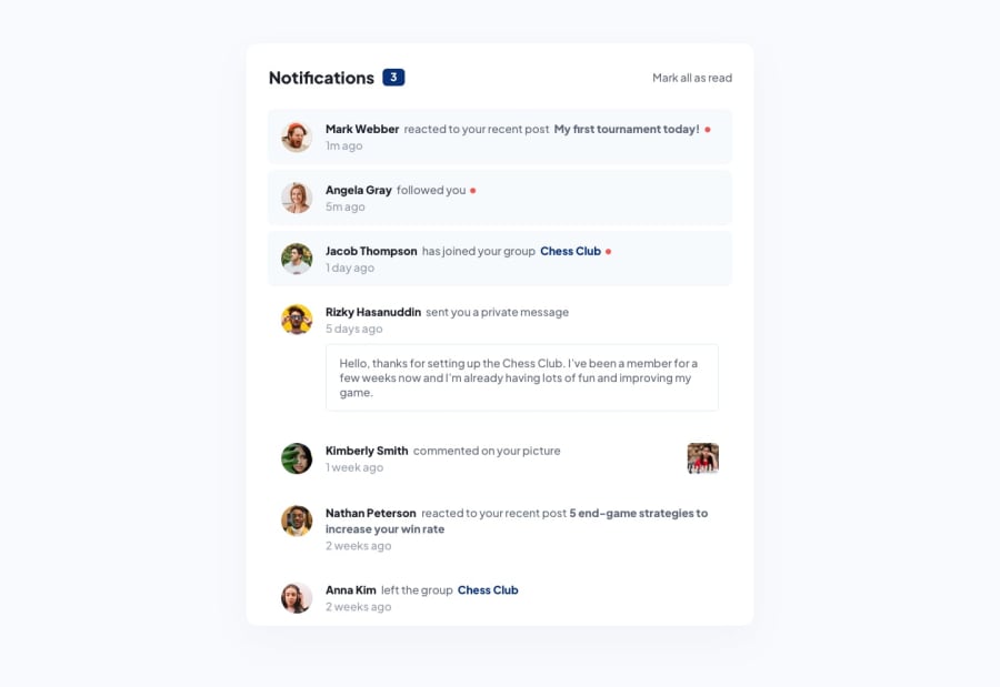
This time I went for sass and webpack bundling (without laravel-mix). I have used font size 16px in the :root element for desktop, used all rem units, then just changed the root font size for mobile. Actually the root font size for mobile is the default and the desktop size (actual expected size) gets applied through media queries because of mobile-first development. Is this a good approach? What could be some possible pitfalls? This must be the fastest I have uploaded a solution after accepting the challenge. Have I done alright? Missed something? Feedback is very much appreciated.
Community feedback
Please log in to post a comment
Log in with GitHubJoin our Discord community
Join thousands of Frontend Mentor community members taking the challenges, sharing resources, helping each other, and chatting about all things front-end!
Join our Discord
