


Design comparison

Solution retrospective
What are you most proud of, and what would you do differently next time?
Again, I view the entire challenge as a single object, which led to my next step
of normalizing the object, in order to get rid of duplicate properties.
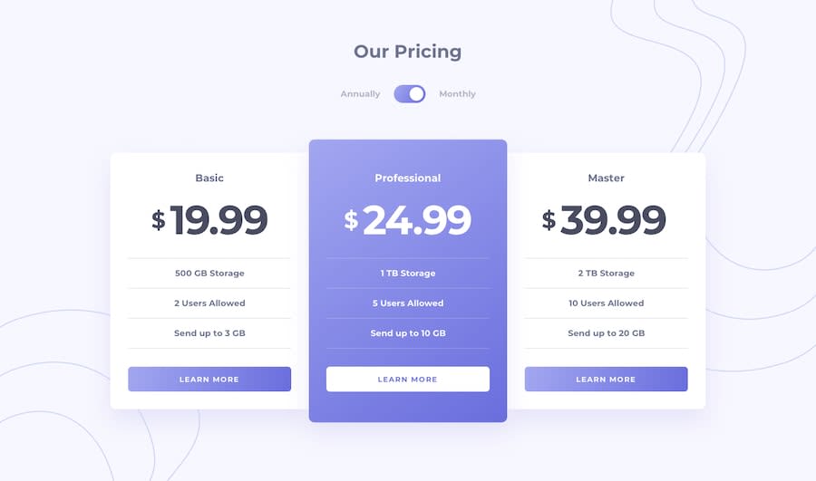
{ id: 0, name: 'Basic', price: {monthly:19.99,yearly:199.99}, storage: '500 GB Storage', users: '2 Users Allowed', speed: 'Send up to 3 GB', pColor: 'black' },
The above object gave birth to an array. The real challenge was to dynamically populate 3 columns grid with a single user defined component name Price.
I'm proud that I was able to call only one price component from a parent page, than to have 3 duplicate components.
What challenges did you encounter, and how did you overcome them?
The challenge I had was to position the bottom and top background images with the unnecessary scroll bar. On the Desktop view I took an advantage of background color which blends well with the images and on the mobile device I had to use tailwind overflow-x-hidden on a main parent div to get rid of horizontal scroll bar that was unnecessary.
What specific areas of your project would you like help with?
LOL, I really wanted to animate my home page to land like @koda solution. I suppose I need to spend time improving my animation skills on tailwind css. I must also give credit to @jen67 she really laid almost 100% expected prototype solution for me.
Community feedback
Please log in to post a comment
Log in with GitHub
Join our Discord community
Join thousands of Frontend Mentor community members taking the challenges, sharing resources, helping each other, and chatting about all things front-end!
Join our Discord