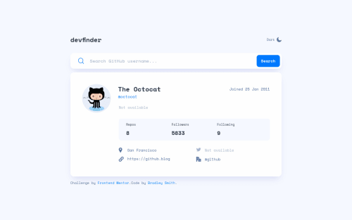
Submitted over 3 years agoA solution to the GitHub user search app challenge
Vue based GitHub User Search App
vue, sass/scss
@bradleyhop

Solution retrospective
In the Figma design file, there's a pointer cursor on the search bar: I don't know what that is supposed to mean. There's already a pointer cursor on the search button, so clicking the bar seems redundant. Does anyone have a clear idea?
Also, seeing anything that I missed in the design is always helpful!
Code
Loading...
Please log in to post a comment
Log in with GitHubCommunity feedback
No feedback yet. Be the first to give feedback on Bradley Smith's solution.
Join our Discord community
Join thousands of Frontend Mentor community members taking the challenges, sharing resources, helping each other, and chatting about all things front-end!
Join our Discord