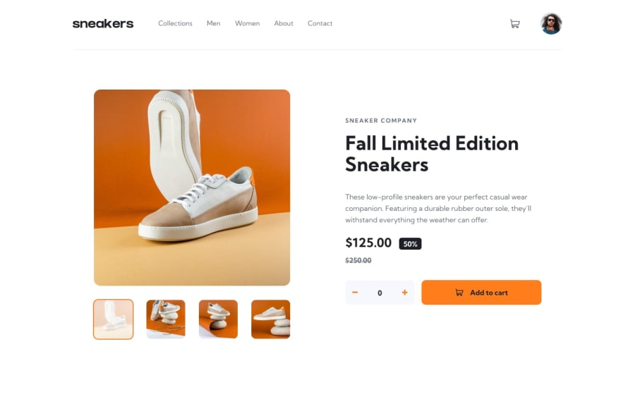
Design comparison
Solution retrospective
Edit: somehow the CSS reset didn't land in the built files which is messing things up xd
This is a Vue 3 solution using singleton composables to access/modify state across different components. This lets you avoid the pattern of parent + prop drill + emit or bringing in something overkill (Vuex, Pinia.).
Critiques: I had a lot of trouble with sizing the SVGs and gave up on that.
The CSS got a little disorganized at times. It's not unusable because it's scoped but next time I might try matching prefixes to folder names ex: components/header to header-something1 header-something2. Then header/cart would be header-cart-somethingA header-cart-somethingB
Nothing besides the svgs.
What specific areas of your project would you like help with?Not sure how to resize the SVGs. I just copied and pasted them into the html where needed at their default size. Changing the width and height attributes caused them to cut off.
Font Awesome allows you to scale them with font-size: 1em, etc. but that didn't appear to be working here so not sure why that is because I obviously don't understand SVGs. If anyone knows what's up with this then feel free to comment.
Community feedback
Please log in to post a comment
Log in with GitHubJoin our Discord community
Join thousands of Frontend Mentor community members taking the challenges, sharing resources, helping each other, and chatting about all things front-end!
Join our Discord
