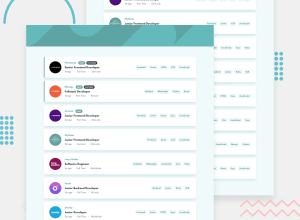
Design comparison
Solution retrospective
Any feedback is welcome
Community feedback
- @tomas938Posted about 3 years ago
Hi, congratulations for completing this challenge! Maybe you can change filtering for me it would be nice if I click for-example filter front-end and senior i would get filtered only that card that match the filter maybe u can check my solution to this challenge and you will see what i mean but overwall good job !. ;)
Marked as helpful0@JohnBroersPosted about 3 years ago@tomas938 Thank you for your reply. I was a little bit in doubt about the filter functionality. But i agree your approach is the better one, and i see that's also how they did it in the design. I just fixed it. Thanks again! :)
0@tomas938Posted about 3 years ago@JohnBroers No problem i think it looks better now good job !
0 - @vikram-gsuPosted about 3 years ago
Hey John, the implementation looks great! Good job! Just one thing I thought was missing was the box shadow on the panels.
Marked as helpful0@JohnBroersPosted about 3 years ago@vikram-gsu Thanks for your reply Vikram. I totally forgot about the box shadow and i just added it. Thank you!
0
Please log in to post a comment
Log in with GitHubJoin our Discord community
Join thousands of Frontend Mentor community members taking the challenges, sharing resources, helping each other, and chatting about all things front-end!
Join our Discord
