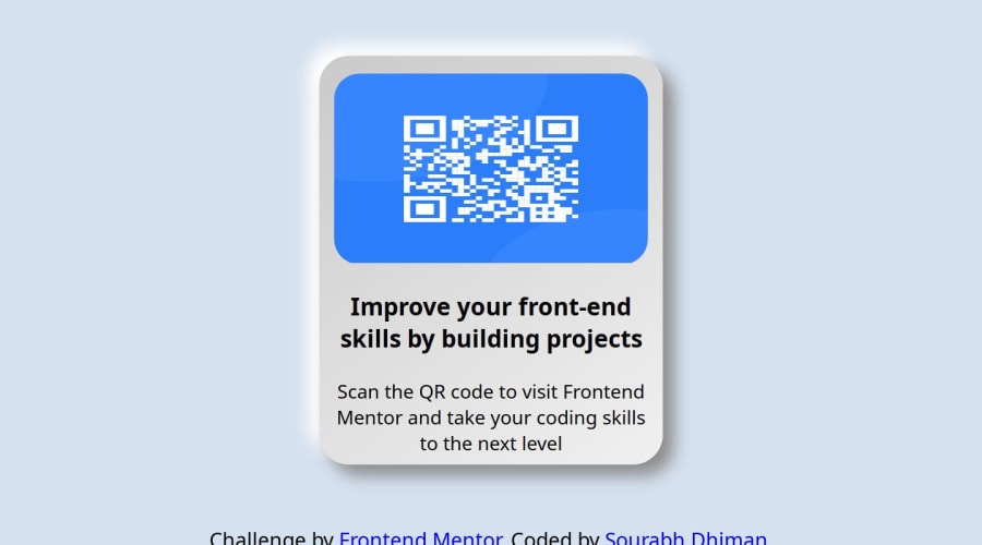
Design comparison
Solution retrospective
What I'm most proud of with my recently built QR code project is the simplicity and effectiveness achieved by using only HTML and CSS. It demonstrates a creative approach to solving a problem without relying on more complex technologies or frameworks. Additionally, I'm proud of the user experience and functionality I was able to deliver within those constraints.
However, reflecting on the project, there are always areas for improvement. Next time, I would consider enhancing the interactivity and functionality further, possibly by incorporating JavaScript to add dynamic features or improve user interactions. Additionally, I might explore optimizing the code for better performance or accessibility, ensuring that the project is as inclusive and efficient as possible. Overall, while I'm proud of what was achieved, there's always room to learn and grow for future projects.
What challenges did you encounter, and how did you overcome them?During the development of my QR code project using only HTML and CSS, I encountered several challenges. One of the main challenges was creating a dynamic QR code that could be scanned by devices while adhering to the limitations of HTML and CSS, which are primarily static languages.
To overcome this challenge, I researched and experimented with various techniques to simulate the appearance of a QR code using CSS. I utilized CSS pseudo-elements, such as ::before and ::after, along with carefully crafted styling to create the black and white patterns typical of QR codes. Although it wasn't a true QR code that could be scanned, it provided a visually convincing representation for the project's purposes.
Another challenge was ensuring cross-browser compatibility and responsiveness. Different browsers interpret CSS rules differently, and ensuring consistency across various browsers can be challenging. Additionally, making the QR code responsive across different screen sizes required careful planning and testing.
To address these challenges, I extensively tested the project across different browsers and devices, making adjustments to the CSS as needed to ensure compatibility and responsiveness. I utilized browser developer tools to identify and fix any rendering issues and applied responsive design principles to ensure the QR code displayed correctly on screens of all sizes.
Overall, by researching, experimenting, and testing, I was able to overcome the challenges encountered during the development of my QR code project, ultimately achieving the desired outcome within the constraints of HTML and CSS.
What specific areas of your project would you like help with?As I reflect on my QR code project built solely with HTML and CSS, there are a few specific areas where I could use some assistance:
-
Improving Accessibility**: While I strived to create an accessible user experience, I would appreciate guidance on further enhancing accessibility features within the project. This could include ensuring proper semantic HTML structure, implementing ARIA attributes where necessary, and improving keyboard navigation.
-
Optimizing Performance**: Although HTML and CSS are relatively lightweight, there may be opportunities to optimize the project for better performance. I would welcome advice on techniques to reduce file sizes, minimize render-blocking resources, and improve page load times without sacrificing functionality or design.
-
Enhancing Interactivity**: While the project currently relies solely on static HTML and CSS, I'm interested in exploring ways to add interactivity using JavaScript. I would appreciate suggestions on how to incorporate JavaScript to enhance user interactions, such as generating QR codes dynamically, providing real-time feedback, or implementing animations.
-
Cross-Browser Compatibility**: Despite my efforts to ensure cross-browser compatibility, there may still be inconsistencies or issues that need to be addressed. I would value assistance in identifying and resolving any compatibility issues, as well as best practices for testing and debugging across different browsers and devices.
Community feedback
- @KrishnaPoddar1Posted 8 months ago
What I think is this could be done without using flex or grid. The idea to have it as a box element was good but as it spreads the displayed QR code doesn't look good. You can give it a width of 300px. this will make it into a good box without it being spread. This is what I implemented.
0@sourabhdhiman1262Posted 5 months ago@KrishnaPoddar1 thanks for the feedback i already solve that issue but it dosen't refresh here it show my old code result
0
Please log in to post a comment
Log in with GitHubJoin our Discord community
Join thousands of Frontend Mentor community members taking the challenges, sharing resources, helping each other, and chatting about all things front-end!
Join our Discord
