


Design comparison
SolutionDesign
Solution retrospective
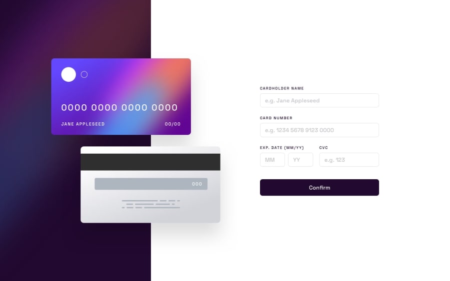
I didn't test this in other browsers, and I didn't implement what appears to be a gradient on the input:active border. I used scale on the card elements in mobile view--is there a better way? I also improved some UX, and changed the font on the card to a monospace font, at least for the numbers. What else can I do to improve this?
Community feedback
Please log in to post a comment
Log in with GitHubJoin our Discord community
Join thousands of Frontend Mentor community members taking the challenges, sharing resources, helping each other, and chatting about all things front-end!
Join our Discord