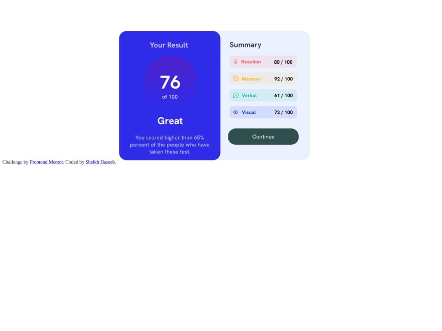
Design comparison
Solution retrospective
as first i use to adjust text using margin but in this design how to set by position relative property
Community feedback
- @danielmrz-devPosted 12 months ago
Hello @sheikhhaseeb559!
I think your project looks great!
If you just change the right side background to
whiteand add abox-shadowto your card, it'll be even closer to the original design.Other than those details, you did a great job!
Marked as helpful0 - @Aphelion-imPosted 12 months ago
To position an element, I use position: absolute, but you have to put: position: relative on the parent container element. I use Flexbox to position elements and sometimes the position relative & absolute combo.
Example html:
<div class="parent-container"> <div class="child">Lorem ipsum</div> </div>CSS:
.parent-container {
width: 500px;
height: 500px;
border: 1px solid red;
position: relative;
}

.child {
width: 100px;
height: 100px;
border: 1px solid purple;
position: absolute;
top: 100px;
left: 250px;
}
I put above code on Codepen, so you can fiddle around with the code:
0@Mazz100Posted 12 months ago@Aphelion-im Hi, to be honest I haven't found any reason to use position element in any project I have done so far, only occurrence I can think of is when we have a specific design that is outside of the flow and we need to position it at some point on screen.
0@Aphelion-imPosted 12 months ago@Mazz100 I barely use it as well.
A usecase for it could be the "Back to top" icon on the bottom right of the screen, with a position: fixed.
Using position is an older technique, just like float based layouts or even table based layouts. I prefer Flexbox or Grid.
Just nice and handy tools to have in your web dev toolbox for a given situation.
0
Please log in to post a comment
Log in with GitHubJoin our Discord community
Join thousands of Frontend Mentor community members taking the challenges, sharing resources, helping each other, and chatting about all things front-end!
Join our Discord
