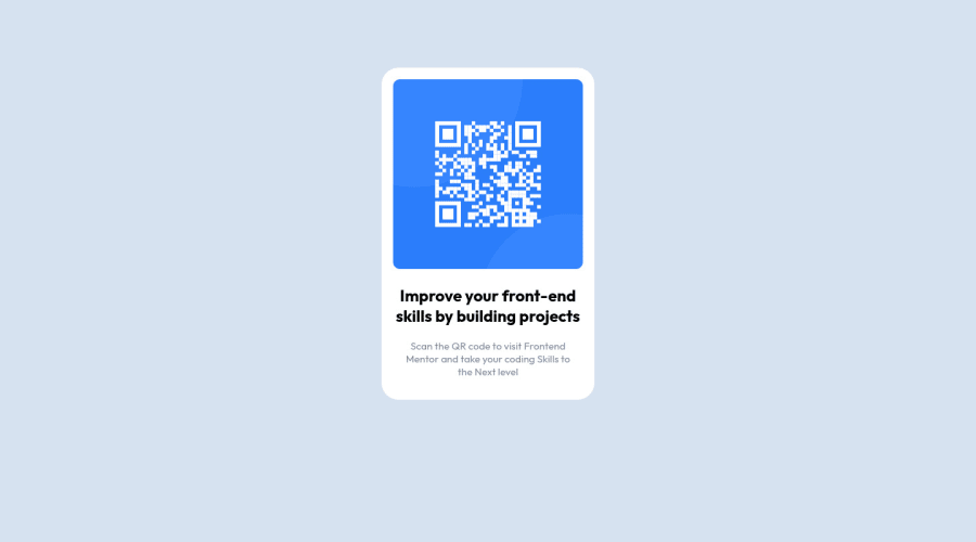
Design comparison
SolutionDesign
Community feedback
- @correlucasPosted over 2 years ago
👾Hello AIyegbajeje, congratulations for your first solution and 😎 welcome to the Frontend Mentor Coding Community!
Your card component is perfect, but is not proper aligned, my advice for your is to use
flexboxinstead of margins to align it, note that adding many margin and padding to align you create problems to control these elements depending of the situation. So always prefer to use a single div to manage the padding and alignments.I did some fixes to your code and you can see it below:
@media only screen and (min-width: 767px)
.card {
    background-color: hsl(0, 0%, 100%);
    /* margin: auto; */
    width: 39%;
    /* padding: 2.7%; */
    border-radius: 25px;
    /* margin-top: 7%; */
}
@media only screen and (min-width: 425px)
.card {
    background-color: hsl(0, 0%, 100%);
    /* margin: auto; */
    width: 69%;
    /* padding: 4.2%; */
    border-radius: 25px;
    /* margin-top: 7%; */
}
👋 I hope this helps you and happy coding!
Marked as helpful0
Please log in to post a comment
Log in with GitHubJoin our Discord community
Join thousands of Frontend Mentor community members taking the challenges, sharing resources, helping each other, and chatting about all things front-end!
Join our Discord
