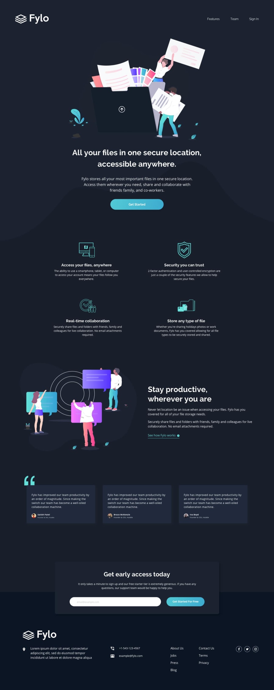
Design comparison
Solution retrospective
I made the desktop design in just one day, but it took me 2 days to make it responsive. Is there any tips for me to apply to think responsively? I find it hard to make my ddesktop website compatible to phone or other devices.
Community feedback
- @vanzasetiaPosted over 3 years ago
👋Hi Lester Fong! My name is Vanza!
I have some feedback on this solutions:
- Try to fix all the issues that has been reported by Frontend Mentor.
- Only use one
h1
on every page, since it is a best practices, the other headings, you can use it multiple times. - Try to use css custom properties, instead of keep repeating the color code, for instance:
:root { --white: hsl(0, 0%, 100%); } body { color: var(--white); } a { color: var(--white); }
- That way, if you need to change all the
color
in the future, you can just change the value of the variable. - The
.navigation a
font size is too small on mobile devices (<400px width). - Try to select the element directly using class, instead of keep increasing specificity, for example instead of doing this:
HTML
<header> <h1>Heading One</h1> <p>I am a paragraph <span>, I am a red span</span></p> </header>
CSS
header { background-color: orangered; color: white; } header h1 { font-size: 3rem; } header p { font-size: 1.1rem; } header p span { color: red; }
- I would recommend to do something like this:
HTML
<header class="header"> <h1 class="header__title">Heading One</h1> <p class="header__description">I am a paragraph <span class="header__span">, I am a red span</span></p> </header>
CSS
.header { background-color: orangered; color: white; } .header__title { font-size: 3rem; } .header__description { font-size: 1.1rem; } .header__span { color: red; }
- Now as you can see, it's much more easier for you, if in the future you need to make changes and you can understand your own code easily. Also, other people can understand your code much easier.
- This naming style is called BEM. You can learn it more from Get BEM website
That's it! Hopefully this is helpful!
Happy Coding!
0 - @NebiyouErsaboPosted over 3 years ago
Hey bro,
I gotta say you've done a great job for desktop view. However, everything looks a bit broken below 1200ish px (mobiles and tablet views). There is some more work that needs to be done on making it responsive.
Again great job on yours!👍
Btw, I also just finished the same challenge few hrs ago. you can def check it out and help me with my issues if possible (https://www.frontendmentor.io/solutions/fylo-dark-theme-solution-htmlcssflexboxgrids-c1HhQJkG2).
0
Please log in to post a comment
Log in with GitHubJoin our Discord community
Join thousands of Frontend Mentor community members taking the challenges, sharing resources, helping each other, and chatting about all things front-end!
Join our Discord