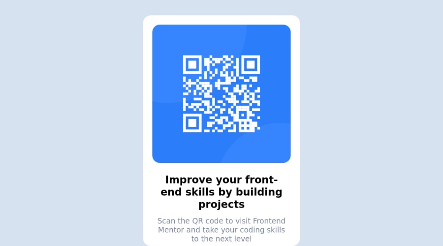
Design comparison
Solution retrospective
I find myself having trouble with coding the margins in CSS and making sure everything is in the center. In addition, I have trouble making it better for the mobile version.
In time, I will keep practicing and get better at it.
Community feedback
- @MelvinAguilarPosted about 2 years ago
Hi @lunk-kml 👋, good job completing this challenge, and welcome to the Frontend Mentor Community! 🎉
Here are some suggestions you might consider:
- There are two modern CSS techniques to center elements:
Using flexbox layout:
body {
   . . .
   /* margin: 50px auto 100px auto; */
   margin: 0;
   width: 100%;
   min-height: 100vh;
   display: flex;
   flex-direction: column;
   justify-content: center;
   align-items: center;
}
Using grid layout:
body {
   . . .
   margin: 0;
   width: 100%;
   min-height: 100vh;
   display: grid;
   place-content: center;
}
Additionally, remove the margin to center the card correctly.
body {
   /*margin: 50px auto 100px auto;*/
}
.white-card {
    /* margin: 0 auto; */
}
Links with more information:
- The Complete Guide to Centering in CSS.
- A Complete Guide to Flexbox (CSS-Tricks).
- How TO - Center Elements Vertically (W3Schools).
- CSS Layout - Horizontal & Vertical Align (W3Schools).
Here are some other suggestions:
- Instead of using pixels in font size, use relative units of measure like
remorem. The font size in absolute length units (px) does not allow users with limited vision to change the text size in some browsers. Reference. - Compared to the design, the card is a bit large.
- Try to use semantic tags in your code. Click here for more information.:
<body>
   <main class="white-card">
      . . .
   </main>
   <footer class="attribution">
      . . .
   </footer>
<body>
I hope those tips will help you.
Good job, and happy coding!
Marked as helpful2 - @AdrianoEscarabotePosted about 2 years ago
Hi KL, how are you?
Welcome to the front-end mentor community!
I really liked the result of your project, but I have some tips that I think you will enjoy:
- Consider using rem for font size .If your web content font sizes are set in absolute units, such as pixels, the user will not be able to re-size the text or control the font size based on their needs. Relative units “stretch” according to the screen size and/or user’s preferred font size, and work on a large range of devices.
if you want to continue coding with px, you can download a very useful extension in vscode, it converts px to rem! link -> px to rem
- To align some content in the center of the screen, always prefer to use
display: flex;it will make the layout more responsive!
Example:
body {
    margin: 0;
    padding: 0;
    display: flex;
    align-items: center;
    justify-content: center;
    min-height: 100vh;
}
The rest is great!
I hope it helps... 👍
Marked as helpful1
Please log in to post a comment
Log in with GitHubJoin our Discord community
Join thousands of Frontend Mentor community members taking the challenges, sharing resources, helping each other, and chatting about all things front-end!
Join our Discord
