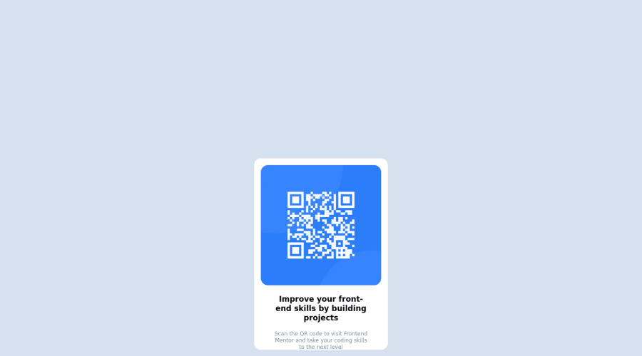
Design comparison
Community feedback
- @MelvinAguilarPosted about 2 years ago
Hello there 👋. Good job on completing the challenge !
I have some suggestions about your code that might interest you.
HTML 📄:
- You should delete a .html file, you could confuse someone with the file "design.html".
- Wrap the page's whole main content in the
<main>tag.
- You should not use inline-CSS because it is not a good practice. Instead, you should use an external stylesheet to style your page. By doing this, you will be able to have a better organization of your code and will be able to understand it better.
Alt text 📷:
- The
altattribute should not contain the words "image", "photo", or "picture", because the image tag already conveys that information.
-
The
altattribute should explain the purpose of the image. Uppon scanning the QR code, the user will be redirected to the frontendmentor.io website, so a betteraltattribute would beQR code to frontendmentor.ioIf you want to learn more about the
altattribute, you can read this article. 📘.
CSS 🎨:
-
To center the component in the page, you should use Flexbox or Grid layout. You can read more about centering in CSS here 📘.
body {
    min-height: 100vh;
    display: grid;
    place-content: center;
}

.main {
    text-align: center;
    background-color: hsl(0, 0%, 100%);
    font-family: 'Outfit', sans-serif;
    /* margin: auto; */
    /* margin-top: 25%; */
    /* margin-bottom: 25%; */
}
CSS Reset 🔄:
-
You should use a CSS reset. A CSS reset is a set of CSS rules that are applied to a webpage in order to remove the default styling of different browsers.
CSS resets that are widely used:
I hope you find it useful! 😄
Happy coding!
Marked as helpful2 - @HassiaiPosted about 2 years ago
Replace<div class="main"> with the main tag and ><p class="p1"> with <h1> to fix the accessibility issues. click here for more on web-accessibility and semantic html
To center .main on the page, add min-height:100vh; display: flex; align-items: center: justify-content: center; or min-height:100vh; display: grid place-items: center to the body.
To center .main on the page using flexbox:
body{
min-height: 100vh;
display: flex;
align-items: center;
justify-content: center;
}
To center .main on the page using grid: body{ min-height: 100vh; display: grid; place-items: center; }Give h1 and p the same font-size of 15px and the same margin-top values. Give p a margin-bottom value and opacity of 0.5 for the faded color.
Use relative units like rem or em as unit for the padding, margin, width values and preferably rem for the font-size values, instead of using px which is an absolute unit. For more on CSS units Click here
Replace the height in .card with a padding value for all the sides, this will prevent the content from overflowing on smaller screens and its a responsive replacement. Give the img a max-width of 100% instead of a width and height value
Hope am helpful.
Well done for completing this challenge. HAPPY CODING
Marked as helpful0 - @Adong-oPosted about 2 years ago
mine is not working on live although i did everything right..can you reach me plz at adongo969@gmail.com im stuck 100googles still no answer.
0@NIKHILKUSHWAHA9877Posted about 2 years ago@Adong-o +1 (201) 619-7431 message me on this number on watsapp i will try to help you
0
Please log in to post a comment
Log in with GitHubJoin our Discord community
Join thousands of Frontend Mentor community members taking the challenges, sharing resources, helping each other, and chatting about all things front-end!
Join our Discord
