Not Found
Not Found
Not Found
Not Found
Not Found
Not Found
Not Found
Not Found
Not Found
Not Found
Not Found
Not Found
Not Found
Not Found
Not Found
Not Found
Not Found
Not Found
Not Found
Not Found

Submitted

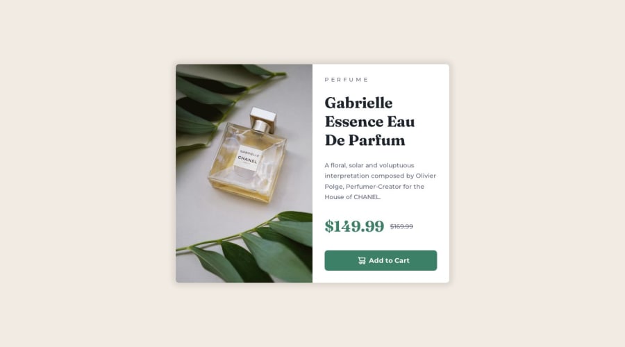
VS Code, No Figma, Single Product Image, CSS Background, Responsive

@mreed4

Desktop design screenshot for the Product preview card component coding challenge

This is a solution for...

  • HTML
  • CSS
1newbie
View challenge

Design comparison


SolutionDesign

Solution retrospective


I tried to use an img tag with classes mobile and desktop that when combined with media queries would show either (a) the mobile image, or (b) the desktop image, but I was not successful. I was more successful in using CSS' background-image with background-size, such that I really only had to use one image, where the CSS magic would make the same image appear as it does in the images provided by the Challenge. The CSS magic was unintentional, so I'm lucky it worked out. Should I be using img tags, or does my solution (w/ background-image and background-size) work? Is it better to serve only a single image? If not, why not?

Community feedback

P
Nohelynaid 180

@Nohelynaid

Posted

I think i'm getting what you were trying to do with the img, however as far a I know whatever img you put in the img tag will display by default meaning if you put both mobile and desktop images will display at the same time therefor in that case you would only have to set display none to the mobile one and in the media query, you would only need to reverse it, i mean set display none to the desktop and display block to the mobile in order for the latter to be displayed when the screen size is a mobile size.

this was the first challenge I did and it wasn't that good with responsive layout, but recently I have done another one that has both mobile and desktop img and it was a pretty good challenge.

Anyway, I hope it helps you!

1

@MaximilianoDanielGarcia

Posted

Hi Matthew, great job!

Yeah, It exists the picture tag for contain multiple source for an img tag. Also, you can define the condition setting the media attribute. Here an example:

<picture>
  <source media="(width <= 465px)" srcset="./images/image-product-mobile.jpg">
  <img src="./images/image-product-desktop.jpg" alt="Product desktop image">
</picture>

1

@hayat139

Posted

Hi, dear, it's a great piece of nicely written work. I can't write like you either. But you missed the hover effect on the button. I believe this happened without your knowledge. I hope you improve your learning and writing skills. Good luck to you

0

Please log in to post a comment

Log in with GitHub
Discord logo

Join our Discord community

Join thousands of Frontend Mentor community members taking the challenges, sharing resources, helping each other, and chatting about all things front-end!

Join our Discord