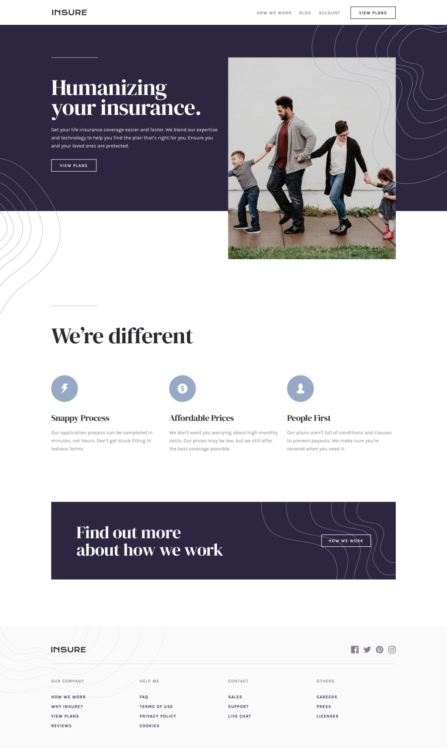
Design comparison
SolutionDesign
Solution retrospective
Do you like it or not? Thank you.
Community feedback
- @chysomm62Posted about 3 years ago
Looks great on mobile except for the menu as already pointed out. Kudos!
Marked as helpful1 - @TiasstiassPosted about 3 years ago
Good job! 👏
Tested it on Safari iOS, looks really good, the only issue I see is the really long hamburger menu.. Is there a reason behind it being 200vh?
Keep up the good work 💪
Marked as helpful1@futuregitPosted about 3 years ago@Tiasstiass Appreciate your input. That's what I figured that I made the menu too long.
0
Please log in to post a comment
Log in with GitHubJoin our Discord community
Join thousands of Frontend Mentor community members taking the challenges, sharing resources, helping each other, and chatting about all things front-end!
Join our Discord
