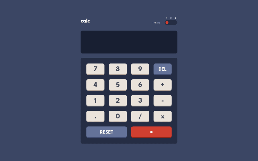
Design comparison
Community feedback
- @terjeeePosted over 2 years ago
How did you center the text inside the buttons?
When I highlight the font 'League Spartan' on Google Fonts there is a huge gap of whitespace underneath the character, which if you look at other solutions, affects most results.
Marked as helpful0@vandermsPosted over 2 years agoHi @terjeee, to be honest I made this project in a hurry and because of that I made a lot of mistakes while implementing the design.
One of them is I forgot to include de fonts in the index.html file, so the font you saw in the screenshot was not League Spartan but the default sans serif font, probably Arial.
I got curious, then I went to see in the design how the designer centered the text inside the buttons. Briefly, they are not centered, the button has a padding-top: 13px and a padding-bottom: 11px.
To fix these errors, I included the font and put the button text inside spans with display block and transform: translateY(1px).
0@terjeeePosted over 2 years ago@vanderms translateY() is a good fix, I assume. I used it in the IP Address Tracker to push the location info section beneath its parent.
How do you make your solutions sizing so close to the design? Do you update the screenshot and make adjustments from there?
0@vandermsPosted over 2 years ago@terjeee I have th figma file, so I have access to the size, colors and spacing between components. Usually, I don't update the screenshot unless there are major issue like different font family :). But before I submit the solution I check to see if my implementation has the same height of the design. If it has, the implementation usually is good enough.
0@terjeeePosted over 2 years ago@vanderms You have the figma files, that makes sense! Thanks for the help:)
0
Please log in to post a comment
Log in with GitHubJoin our Discord community
Join thousands of Frontend Mentor community members taking the challenges, sharing resources, helping each other, and chatting about all things front-end!
Join our Discord
