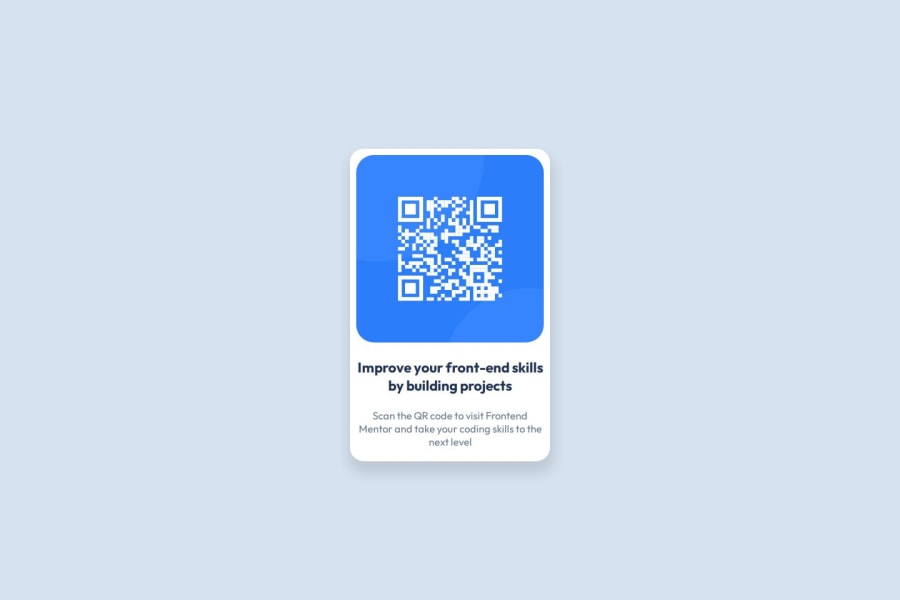
Not Found
Not Found
Not Found
Not Found
Not Found
Not Found
Not Found
Not Found
Not Found
Not Found
Not Found
Not Found
Not Found
Not Found
Not Found
Not Found
Not Found
Not Found
Not Found
Not Found

Submitted

Visual studio code

@Olaniyi-Fatola

Desktop design screenshot for the QR code component coding challenge

This is a solution for...

  • HTML
  • CSS
1newbie
View challenge

Design comparison


SolutionDesign

Solution retrospective


What are you most proud of, and what would you do differently next time?

This is my first time creating a project with html and css and for the fact that I'm able to achieve the replica of the challenge given, I'm proud of that.

What challenges did you encounter, and how did you overcome them?

I encountered the challenge of image directory as I was unable to direct the code the it but I later moved the image to the same directory as the code file, and so it was easy to point to the image like that.

What specific areas of your project would you like help with?

I'll like help with the css style code because I believe the codes written were too much and also will reduce the speed of the page. Kindly help with the irrelevant code that are in there and how I can make it more effective.

Community feedback

@SvitlanaSuslenkova

Posted

body { display: flex; flex-direction: column; justify-content: center; align-items: center; min-height: 100vh; } Try this to align(top-bottom) and justify(left-right) your project to the center. It applies to the parent component(body), don't forget about !!min-height!!. You can use grid instead of flex too.

Marked as helpful

1

@Olaniyi-Fatola

Posted

@SvitlanaSuslenkova Thank you for this, will try out the grid too

0
P
Steven Stroud 11,810

@Stroudy

Posted

Amazing job with this! You’re making fantastic progress. Here are some small tweaks that might take your solution to the next level…

  • Using a <main> tag inside the <body> of your HTML is a best practice because it clearly identifies the main content of your page. This helps with accessibility and improves how search engines understand your content.

  • Having a clear and descriptive alt text for images is important because it helps people who use screen readers understand the content, making your site more accessible. It also improves SEO, as search engines use alt text to understand the image's context, helping your site rank better, Check this out Write helpful Alt Text to describe images,

  • Using a full modern CSS reset is beneficial because it removes default browser styling, creating a consistent starting point for your design across all browsers. It helps avoid unexpected layout issues and makes your styles more predictable, ensuring a uniform appearance on different devices and platforms, check out this site for a Full modern reset

  • While px is useful for precise, fixed sizing, such as border-width, border-radius, inline-padding, and <img> sizes, it has limitations. Pixels don't scale well with user settings or adapt to different devices, which can negatively impact accessibility and responsiveness. For example, using px for font sizes can make text harder to read on some screens, Check this article why font-size must NEVER be in pixels. In contrast, relative units like rem and adjust based on the user’s preferences and device settings, making your design more flexible and accessible. Use px where exact sizing is needed, but prefer relative units for scalable layouts. If you want a deeper explanation watch this video by Kevin Powell CSS em and rem explained. Another great resource I found useful is this px to rem converter based on the default font-size of 16 pixel.

You’re doing fantastic! I hope these tips help you as you continue your coding journey. Stay curious and keep experimenting—every challenge is an opportunity to learn. Have fun, and keep coding with confidence! 🌟

Marked as helpful

1

@Olaniyi-Fatola

Posted

@Stroudy Thank you so much, this is so helpful. Will check all resources and also take note best practices

1
P
Steven Stroud 11,810

@Stroudy

Posted

Hey @Olaniyi-Fatola, No problem, You got this! 💪

0

@Olaniyi-Fatola

Posted

Hello @Stroudy , Kindly check it now. What do you think?

1
P
Steven Stroud 11,810

@Stroudy

Posted

Hey @Olaniyi-Fatola, Just checked, Great stuff with the <main> and alt="" text, You could still really benefit from using a Full modern reset in future projects make sure you start with that, Not now as it will break your solution.

Here these should really be in rem and using a max-width: 20rem;

.box{
    width: 320px;
    height: 500px; }

You shouldnt really use height: 500px because the height should be set my the elements in side it on this challenge, You could add some padding down there in stead,

You got this, 💪

Marked as helpful

1

@Olaniyi-Fatola

Posted

Hmm, that make sense @Stroudy . Thank you so much, will keep it all in mind

1

Please log in to post a comment

Log in with GitHub
Discord logo

Join our Discord community

Join thousands of Frontend Mentor community members taking the challenges, sharing resources, helping each other, and chatting about all things front-end!

Join our Discord