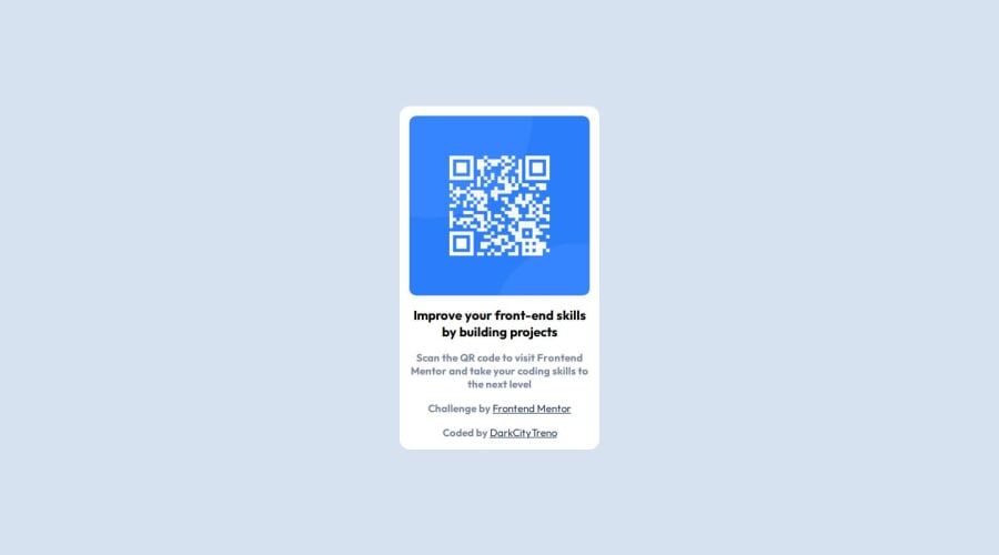
Very novice. Didn't use Figma. Probably wrote a lot of dumb stuff.


Design comparison

Solution retrospective
The entire thing was a big challenge despite being the simplest stuff. Turns out writing stuff is not the same as watching courses and "understanding" the concepts (duh).
What specific areas of your project would you like help with?Any constructive criticism is very welcome.
Community feedback
- @DylandeBruijnPosted 9 months ago
Hiya @DarkCityTreno,
Congratulations on a great looking solution. Writing stuff is definitely not the same as watching courses. But that's probably why you are here on Frontend Mentor, to get out of tutorial hell. I like that you used
display: gridandplace-content: centerto center the card. It's a very clean solution.A bit of friendly constructive feedback:
-
I'm happy to see you used
min-height: 100vhon thebody. A lot of people make the mistake to useheight: 100vh. -
I like that you used cascading by putting
text-align: centeron themain. -
You can make the card a bit more responsive by changing your styling to this:
main {
    max-width: 450px;
    width: 100%;
    padding: 5%;
    background-color: hsl(0, 0%, 100%);
    border-radius: 15px;
    text-align: center;
}
If you want the same
paddingon all the sides you don't have to writepadding: 5% 5%you can shorten it topadding: 5%.-
I suggest looking into CSS variables, they help you make your CSS values more reusable across your code.
-
You could add a bit of
paddingto yourbodyto give your card a bit of spacing between itself and the edges of the viewport.
Again good job on your solution and I hope you find my feedback helpful. If you do I would appreciate it if you can mark it as helpful!
Happy coding!
Marked as helpful1@DarkCityTrenoPosted 9 months agoHey @DylandeBruijn Thank you so much for your feedback. You're absolutely right about padding, just really hard to remember stuff cuz it's a lot take in for a beginner. Will defenitely look into CSS variables. Really appreciate the criticism bro cheers!
0@DylandeBruijnPosted 9 months agoHiya @DarkCityTreno,
No worries at all! I understand all too well how hard it is to remember stuff. And it's hard to keep track of things sometimes as your project grows. I'm glad I could help you out! If you have any more questions I would be happy to answer them.
1 -


Please log in to post a comment
Log in with GitHubJoin our Discord community
Join thousands of Frontend Mentor community members taking the challenges, sharing resources, helping each other, and chatting about all things front-end!
Join our Discord