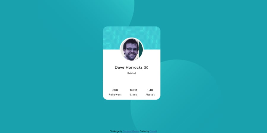
Design comparison
Solution retrospective
This is my very first work, I believe there are lots of fundamental errors in the way I structured the HTML. Following that, I learned a lot of CSS so hopefully that looks a little smarter. I would love to know how I could better structure the HTML. I would also like to know if the CSS is written in a good way.
I think I copied my repl.it so there may be a lot of (weird) notes!!
Community feedback
- @herbrasPosted about 4 years ago
Wow... it's great...👏 Specially "rotate device" section
0@DaveyJHPosted about 4 years agoThanks. I had given up by the time I realised it looked horrible landscape....So I cheated :P
I like your version, very neat. I re-worked mine but I can't get the font right and I need to adjust the background. Very happy with the difference though. https://github.com/DaveyJH/first-challenge-redo
0 - @iamtimleonardPosted about 4 years ago
Nice work - it looks really close to the goal. Try using more semantic HTML tags. Instead putting all your text in
<span>s, use<p>s or headers. Instead of using only<div>s try using<section>s andmain0@DaveyJHPosted about 4 years agoI have written the code again here. I think this has better semantics...but I can't get the font quite right. Thanks for the advice and the comment.
0@iamtimleonardPosted about 4 years ago@DaveyJH nice! those semantic elements are important for people who are visually impaired - screen readers look for landmarks and headers. i would consider putting the profile image in a
<img>tag for that reason0
Please log in to post a comment
Log in with GitHubJoin our Discord community
Join thousands of Frontend Mentor community members taking the challenges, sharing resources, helping each other, and chatting about all things front-end!
Join our Discord
