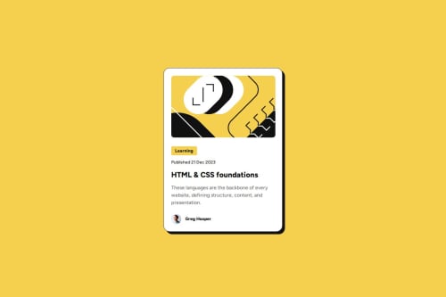
Submitted about 1 year agoA solution to the Blog preview card challenge
Vertical alligning and border radius
@AskArtwentythree

Solution retrospective
What are you most proud of, and what would you do differently next time?
I am glad to learn about vertical allignment and work with shadows. Looking forward to work with them more
What challenges did you encounter, and how did you overcome them?Did not know at first how to put text in center near image, vertical allignment helped.
What specific areas of your project would you like help with?Is the distance betweem image and text is good, I mean it should be like that?
Code
Loading...
Please log in to post a comment
Log in with GitHubCommunity feedback
No feedback yet. Be the first to give feedback on Askar's solution.
Join our Discord community
Join thousands of Frontend Mentor community members taking the challenges, sharing resources, helping each other, and chatting about all things front-end!
Join our Discord