Design comparison
SolutionDesign
Solution retrospective
UPDATE take 2: Addressed accessibility errors; and design. Thanks for the tips FEM community!
UPDATED: Added opacity.
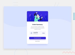
I am having a hard time finding the correct color for the primary-button hover. And also how to arrange the elements in the middle text box (including image). Any tips appreciated.
Community feedback
- @Nova988Posted about 3 years ago
Hello,
For the background color on hover: did you try opacity? And you need to reduce the width of the image in the middle text box. It is set to 100%
Hope it helps
Marked as helpful0 - @kens-visualsPosted about 3 years ago
Hey @KristaCalleja 👋🏻
I have some quick tips on how to fix the accessibility issues and some minor design ones as well.
- In your markup <div class="card">...</div> should be <main class="card">...</main> and <div class="attribution">...</div> should be <footer class="attribution">...</footer>. These will fix most of your accessibility issues. Don't forget to generate a new repot once you fix the issues.
- For Annual Plan you used
<h3>tag, however in HTML heading tags must decrease gradually, like<h1>, <h2>, <h3>, and so on. So in order to fix that issue you can swap<h3>with<h2>. - What comes to design, I have a couple of suggestions. First, you should add these two lines of styles to the button,
.primary-btn { width: 80%; padding: 1em 0; }- And then you should also change the
widthof.optionstowidth: 70%;, so it matches the width of the button.
I hope this was helpful 👨🏻💻 you did a superb job. Cheers 👾
2@KristaCallejaPosted about 3 years ago@kens-visuals Precious advice! Really appreciate it thank you!
0
Please log in to post a comment
Log in with GitHubJoin our Discord community
Join thousands of Frontend Mentor community members taking the challenges, sharing resources, helping each other, and chatting about all things front-end!
Join our Discord
