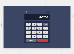
Design comparison
Solution retrospective
would like to implement the custom toggler in future and suggestions are welcomed
Community feedback
- @hardy333Posted about 3 years ago
Hey nice solution design looks very clean, you have done very good job.
Few suggestions:
- Try to make it responsive.
- restrict user to use multiple math operator symbols back to back like : -+/ ...
Marked as helpful3 - Account deleted
Hi,
Nice one on completing the challenge, it looks ok but there's some things I'd like to mention;
-
When you switch the theme, the whole page becomes un-styled for a second, not sure what's causing it.
-
The calculator's functionality seems good, besides the fact that you can enter a period(.....) multiple times, which should be restricted.
-
Put cursor pointer on the buttons just to give the satisfactory that they are clickable.
Marked as helpful1@nirbhay12345Posted about 3 years ago@thulanigamtee please check it again I have tried to solve the three problems
- it was because of unnecessary imports i was making in the index.js when i could directly right the styles in one file itself. Thus, the imports gave a round trip to the files and so the switch theme problem
- the period simply added a if statement -> thank you for pointing out
- yeah it was a great idea also thinking of adding some press animation
0 -
Please log in to post a comment
Log in with GitHubJoin our Discord community
Join thousands of Frontend Mentor community members taking the challenges, sharing resources, helping each other, and chatting about all things front-end!
Join our Discord
