Design comparison
SolutionDesign
Solution retrospective
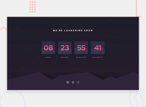
This was really fun. I don't think I got the positioning or the colors right- But I was really just excited about the opportunity to code up a flipping counter.
I'm pretty happy with it but there's some minor visible tearing in the center that I don't think is particularly noticeable.
Fun Project.
Community feedback
Please log in to post a comment
Log in with GitHubJoin our Discord community
Join thousands of Frontend Mentor community members taking the challenges, sharing resources, helping each other, and chatting about all things front-end!
Join our Discord
