Design comparison
Solution retrospective
Any feedback?
Community feedback
- @MaciejNarejkoPosted over 1 year ago
Hello there 👋
Here's the feedback:
-
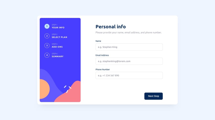
When the user goes to at least the second step and then goes back to the first step, the "Go Back" button should be not available in the first step. Add a condition in the goBack() function to handle the case when currentPageNumber is 1.
-
After entering all fields incorrectly on the first page of the form, and then correctly filling in some of them, the error message for those correct fields does not disappear.
-
The background and foreground colors do not provide sufficient contrast ratio, which can strain the user's eyes. Consider adjusting the color scheme to ensure better readability and accessibility.
-
The document lacks a meta description tag <meta name="description">.
-
Remove unused code, such as the addOnLabels array: const addOnLabels = ["Online Service", "Larger Storage", "Customizable Profile"];
-
Replace occurrences of var with let or const for consistency. For example: let label = checkbox.parentNode;
-
Consider extracting reusable code into helper functions to improve modularity and readability.
I hope I provided at least some useful feedback. Happy coding 🙂
Marked as helpful1@aryanda1Posted over 1 year ago- for the first point, i think that we shouldnt show the user something which he cant interact with that, like if he cant go the previous page what its use?
- for the second point, some use onChange like constantly checking after each change or after each onblur event to check whether the field is invalid or valid. So some people give feedback when the user types it or just disable the button or just do everything in the end. For each keystroke changed, doesn't it increases more overhead?
- the third point, do u mean the text color and background color?
For the other points i will work out. Thanks @MaciejNarejko
0@MaciejNarejkoPosted over 1 year ago- The "Go Back" button should not be available in the first step after going back from the second step.*
- You're right that checking the validity of a field after each keystroke can indeed introduce some overhead. What I meant was that in the case described above, the validation doesn't clear the error information from fields that are already valid after pressing the next step button.
- The text color and background are very similar, which impairs readability. Consider changing the color of the text, it's just a suggestion.
0@aryanda1Posted over 1 year agohey i corrected most of them. Thanks again! @MaciejNarejko
1 -
Please log in to post a comment
Log in with GitHubJoin our Discord community
Join thousands of Frontend Mentor community members taking the challenges, sharing resources, helping each other, and chatting about all things front-end!
Join our Discord
