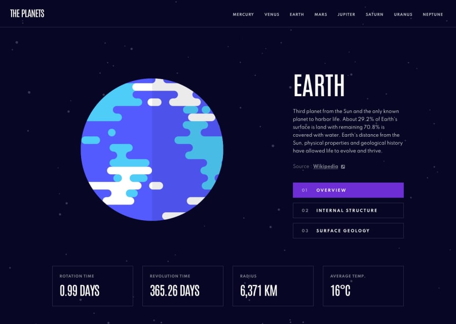
Design comparison
Solution retrospective
Used flexbox for the content (overview, internal structure, & surface geology buttons, planet image, & text). For tablet and desktop, how can I keep the content centered when changing size of screen?
In index.css, is there a better way to handle media queries? My approach seemed to make the css overly complicated.
Used javascript to handle the showing / hiding of content when clicking the overview, internal structure, & surface geology buttons. My solution ended up being a bit bloated. Is there a way to set up a function that could maybe loop through a list of properties that would handle this behavior?
Used js to change the background color for the overview, internal structure, & surface geology buttons when on a specific planet. How could I make this code simpler / less code?
Used js to change the border color for the overview, internal structure, & surface geology buttons in mobile when on a specific planet as well as changing the border color when on tablet / desktop in the nav menu (planet names). How could I make this code simpler / less code?
Community feedback
- @Da-vi-dePosted over 3 years ago
Hi, that's a nice result for this challenge because it's done in plain JS and it's not easy as it seems to be. I get a sense you put all your effort to make it work and it works, so be proud of it! I can't judge all your code because there's a lot to process but i did the same challenge and at least i can answer to one question (which is important i guess) you asked.
- What we have in this challenge is a "tab component", i dealt with it when i was studying JS a while back and i was taught one of the best way to make it work is taking advantage of a natural process that happens behind the scenes in the DOM, it's a phase called "capturing and bubbling", maybe you are familiar with this concept.
By adding the
eventListenerto the parent element you can tell JS exactly theevent.targetwhich are the buttons in our case, the buttons have the attributedatathe value is a number, when the code is interpreted it goes down to the end of the parent element (capturing phase) then like boiling water it goes all the way up (bubbling phase) and it stops when it gets to the beginning of the parent element where theeventhas been fired, so you take as many birds as you want with just one stone. I can copy and paste my code here but it's a lot, so feel free to go to my profile click on my project and inspect github code, take your time because it's not straight forward, especially JS. In case you need to clarify anything about it ask me.
Hope it helps a little, keep coding :-)
Marked as helpful1@chrisyoung0101Posted over 3 years ago@Da-vi-de Hey! Thanks for your feedback. Yes, this challenge is deceptively more complicated than it appears to be. Thanks for pointing out "capturing and bubbling" as this is something I need to finally just 100% learn. I'll ask questions about your solution in your solution's feedback.
1 - What we have in this challenge is a "tab component", i dealt with it when i was studying JS a while back and i was taught one of the best way to make it work is taking advantage of a natural process that happens behind the scenes in the DOM, it's a phase called "capturing and bubbling", maybe you are familiar with this concept.
By adding the
Please log in to post a comment
Log in with GitHubJoin our Discord community
Join thousands of Frontend Mentor community members taking the challenges, sharing resources, helping each other, and chatting about all things front-end!
Join our Discord
