Design comparison
Solution retrospective
Hi all 😌
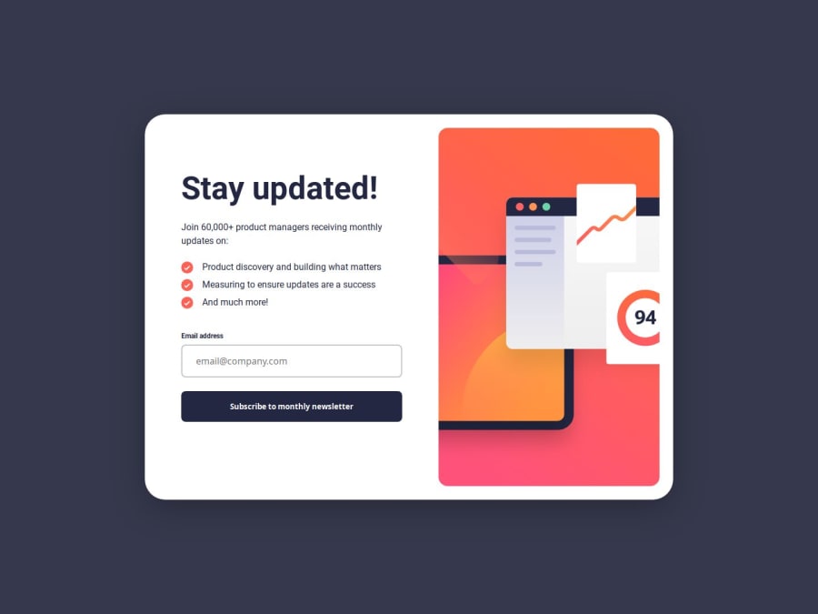
This is my first Frontend Mentor project of the year. I decided to go back to basics and get some practice using vanilla JS and CSS after spending the last six months or so using React for my frontends. I am quite happy with the responsivity of the component. The transitions and validation also add a nice touch.
As always, I am very much interested in any feedback (especially constructive) that can be given. It really is the best way to learn.
P.S. I just want to make a point of thanking the Frontend Mentor community as a whole, which has been incredibly encouraging, supportive, and helpful throughout my development. It is no exaggeration to say that the skills I have gained over the last year are owed to a significant degree to this community.
Community feedback
Please log in to post a comment
Log in with GitHubJoin our Discord community
Join thousands of Frontend Mentor community members taking the challenges, sharing resources, helping each other, and chatting about all things front-end!
Join our Discord
