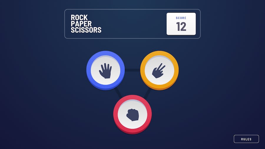
Design comparison
Solution retrospective
I really enjoyed this challenge as I had a chance to practice and apply asynchronous functions as well as Sass. Learnt about some curious little aspects of @mixins, too. Now, I am eager about your insights on ways to grow, improve and code better!
Community feedback
- @ApplePieGiraffePosted almost 4 years ago
Hello there, again, Vytautas! 👋
Of course, it's nice to see you complete another challenge! 😀 Well done on this one! 👍 Your solution looks good and works well and I like the little animations you added here and there to give your solution that extra touch! 🙌
I only suggest perhaps moving over the "Rules" button a little bit so that it does not get covered by the rock, paper, or scissors tokens when the results animation is played (on my desktop screen, the token moves to the right and covers up most of the button). 😉
As usual, keep coding (and happy coding, too)! 😁
1@vytkuklysPosted almost 4 years ago@ApplePieGiraffe Hello there, 👋 It is nice to see that you are taking your time to draw my attention to aspects that could be improved once more. I really appreciate it 👍 The issue with the rules button was apparently relate to the lack of responsiveness in terms of screen height. Now it should be fine
1@ApplePieGiraffePosted almost 4 years ago@vytkuklys
NP! 😀 I just took another look at your solution, and the issue's indeed fixed! 👍
0
Please log in to post a comment
Log in with GitHubJoin our Discord community
Join thousands of Frontend Mentor community members taking the challenges, sharing resources, helping each other, and chatting about all things front-end!
Join our Discord
