Design comparison
Solution retrospective
Hello,
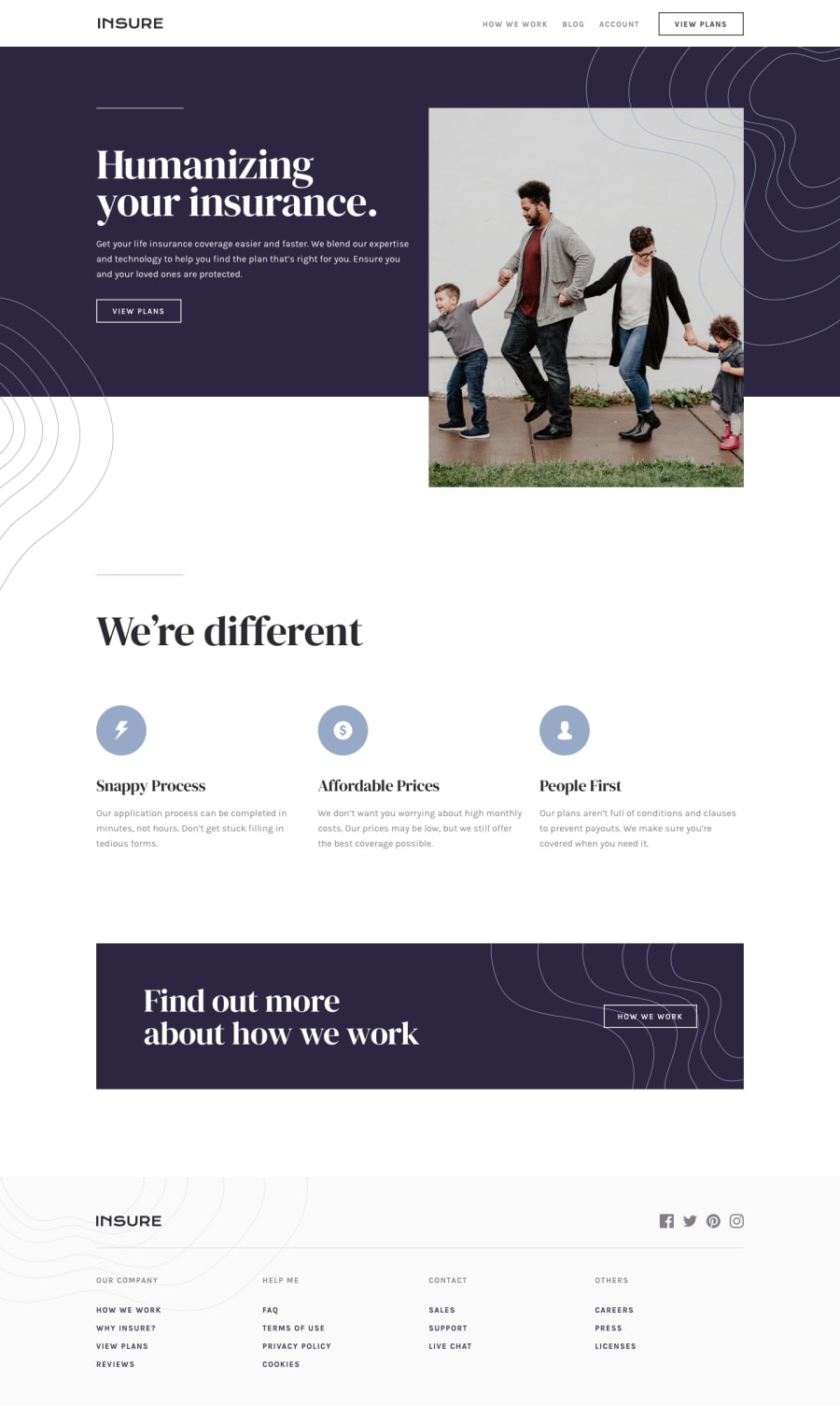
Could someone advise me why there is an empty space between the hero image and the section below it?
The wrapping element of the image (picture tag) has a slightly larger height than the image it contains but I don't understand why.
Thanks
Community feedback
- @MichalTrubiniPosted almost 3 years ago
Hello there,
Thanks for the feedback. I don't know what's wrong but when I click on "Preview site", the layout looks the way it should (as per the design figma file). However, the screenshot of the site (generated above these comments) shows the hero image on the left with "Humanizing your insurance" missing. Because the layout is correct when you go to the actual site,
right: 12%should not be necessary. Or maybe I misunderstood you?What I forgot to mention when writing my original post is that the gap between hero image and the section that follows is visible on mobile devices.
Michal
0 - @RioCantrePosted almost 3 years ago
Hello there! Good job with this one. I could give you some suggestion regarding the issues.
- To make the hero image position to the right, add the value of
right: 12%;inside the rule set of.hero_image. You can adjust the value later on. - To fix the space between the hero image and the content, add
padding-right: 0;andmargin-left: 2rem, adjust the values according to you liking. - Adjust the padding and margin on every sections.
I hope this helps and keep up the good work!
0 - To make the hero image position to the right, add the value of
Please log in to post a comment
Log in with GitHubJoin our Discord community
Join thousands of Frontend Mentor community members taking the challenges, sharing resources, helping each other, and chatting about all things front-end!
Join our Discord
