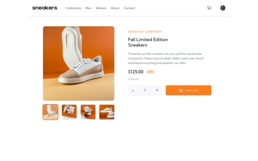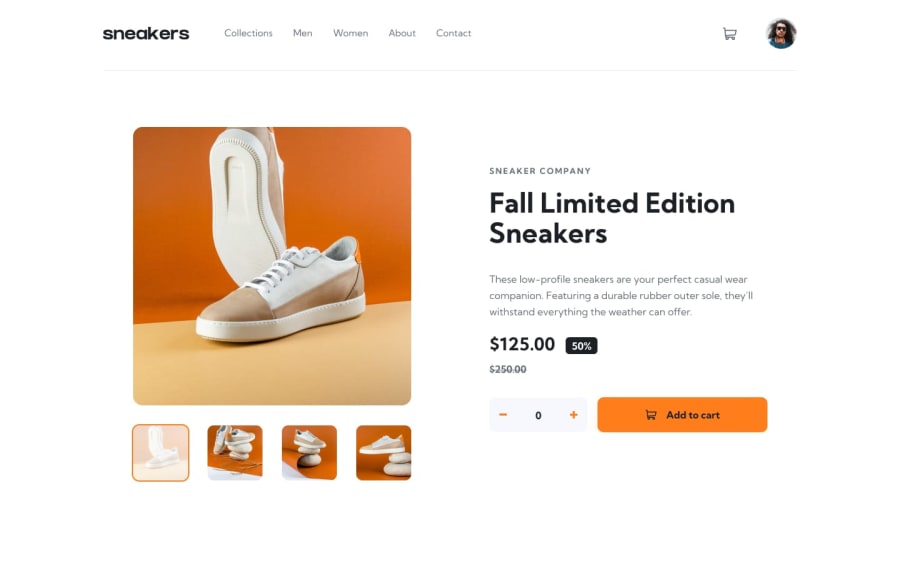
Design comparison
Solution retrospective
I am looking for suggestions to make it even more better.
Current problem
Currently, what I can think of is locking focus in modals, sidebar. For that, what I thought of doing is adding tabindex="-1" to all buttons, anchor tags, but left it for some time...
Community feedback
- @shashreesamuelPosted over 2 years ago
Hey Manik2375, good job completing this challenge. Keep up the good work
Your solution looks great however I think that the titles and description are supposed to be a bit bigger in addition to the overall content.
In terms of the validation errors
-
Attribute area-hidden not allowed on element svg at this point.
-
Possible misuse of
aria-label, you don't need the aria-label on a heading element
I hope this helps
Cheers Happy coding 👍
Marked as helpful1@Manik2375Posted over 2 years ago@TheCoderGuru Thanks for suggestions!
Oh, I will make them a bit larger then, used to small fonts :sweat_smile:
And I am not really sure about validation errors,
-
I believe the validator is thinking
svgas an important element here (perhaps like with some text content), but its just for decoration purpose, for example this article https://web.dev/learn/design/icons/ -
Yeah, I think that is little weird because
aria-labelis more like for accessible interactive things, from my POV. But when reading from screenreaders, it is useful. Perhaps I should usetitlehere, to avoid ruining the design.
Once again, really thanks for reviewing it! I really appreciate this!
0 -
Please log in to post a comment
Log in with GitHubJoin our Discord community
Join thousands of Frontend Mentor community members taking the challenges, sharing resources, helping each other, and chatting about all things front-end!
Join our Discord
