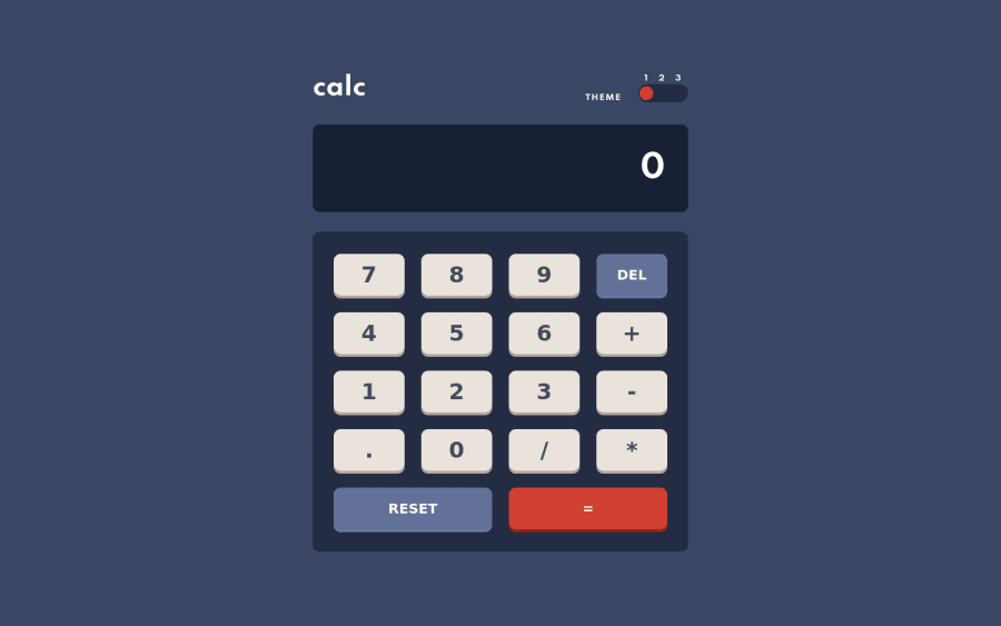
Vanilla JS, CSS grids, Theme Switchers, calculator, class objects
Design comparison
Solution retrospective
One of the main difficulties was implementing three-state toggle switch changes to the theme of the calculator. However, with useful resources, I was able to overcome this.
Community feedback
- @0GeNN0Posted almost 3 years ago
Hi your job is great and there is some feedback 1-- Use semantic elements to avoid accessibility like "main" "header" and "footer" or you can use role attribute to describe the role of the screen readers check this https://dequeuniversity.com/rules/axe/4.3/region?application=axeAPI. 2-- Instead of putting the theme class to the HTML tag give it to the body tag it works too. 3-- If you want to use input for the toggle you should use label too, but I think the 'UL' tag with some of the CSS you will get the job done too 4-- If you could render the sum it will be very good so the user can see the whole sum he could mistake and want to delete rendering the whole sum will help him very will 5 -- The app didn't make the calculation when I click on the equal button if it's not correct so if you can handle this to show an error 'Syntax error' to the user when it happens it will be great.
Marked as helpful0@Yakub-EgamnazarovPosted almost 3 years ago@0GeNN0 Hi, thank you very much for your comments, let me work on the issues and suggestions you have given. And will get back at you so you could check if you don't mind.
0
Please log in to post a comment
Log in with GitHubJoin our Discord community
Join thousands of Frontend Mentor community members taking the challenges, sharing resources, helping each other, and chatting about all things front-end!
Join our Discord
