Design comparison
SolutionDesign
Community feedback
- @hector-kuentroPosted over 1 year ago
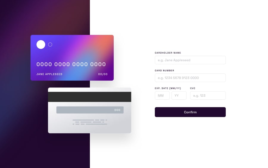
Hi, liked your card form. Just a simple hover effect on inputs would be nice, and I think the button background color change on is too aggressive, maybe for the background-clip. But in general, great solution!
1
Please log in to post a comment
Log in with GitHubJoin our Discord community
Join thousands of Frontend Mentor community members taking the challenges, sharing resources, helping each other, and chatting about all things front-end!
Join our Discord
