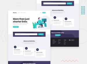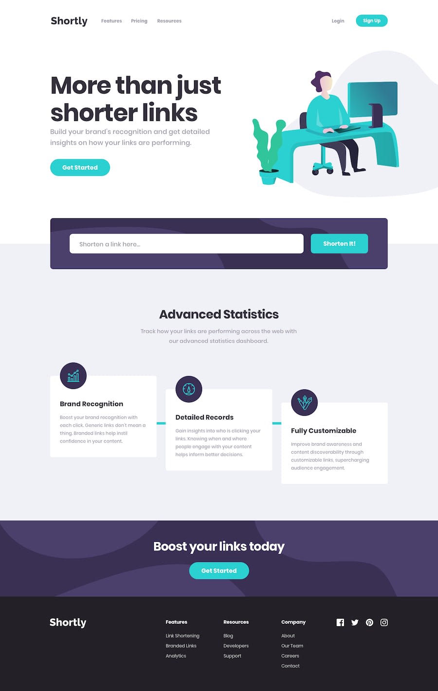
Design comparison
SolutionDesign
Solution retrospective
Added a delete Button, otherwise the locally stored items would just keep stacking up with no respite in sight. The little blue divider in the cards section is all over the shop if the screen size isn't exactly mobile or (my..) desktop size. Looking forward to seeing other solutions to see how this problem may be rectified with some better CSS skills. yew..
Community feedback
Please log in to post a comment
Log in with GitHubJoin our Discord community
Join thousands of Frontend Mentor community members taking the challenges, sharing resources, helping each other, and chatting about all things front-end!
Join our Discord
