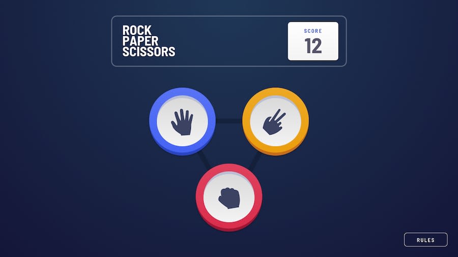
Design comparison
SolutionDesign
Solution retrospective
It would be nice to get the final effect of the expanding circle borders on the winning hand, I look forward to seeing other's solutions to this.
If I were to do the task again, I would aim to reduce the hardcoded values in CSS to allow for a fully responsive design. I started with these to get the initial layout, then just ploughed on with them... defs doesn't look like best practice.
I think there are a million ways to tackle this game, so any suggestions for refactoring will be appreciated.
Community feedback
Please log in to post a comment
Log in with GitHubJoin our Discord community
Join thousands of Frontend Mentor community members taking the challenges, sharing resources, helping each other, and chatting about all things front-end!
Join our Discord
