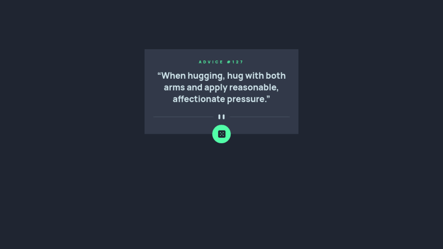
Design comparison
SolutionDesign
Solution retrospective
Hey all, could you please let me know any best practises in regards to sizing, I have hard coded some pixels here and there and used rems in other places. Would this be passable in a work environment? Thank you for your valuable feedback. Regards Milen
Community feedback
- @ChamuMutezvaPosted over 2 years ago
Greetings Milen
So far so good π, with a few improvements need
- use semantic elements such as header, main, footer. The main element should contain the main content for your web page and therefore in my opinion should always be available in a site.
- look into responsive image techniques for resolution switching, cases where there is an image for small devices and other images for other sizes. The common ones include srcset and picture element.
- an interactive element , such as a button should have readable text, for accessibility reasons. It is the text that can be read by assistive technology.
- the card has a fixed width of 375px, this prevents the site from being viewed nicely on small devices of less than that size. I would suggest to use a max-width to control the card to not exceed a certain a width and adding
padding-inline
on the parent element(body) so that , they is some space between the card and the body - it is beneficial to use classes for styling ahead of ids, a class is re-useable.
- research on a css reset file to use , some elements such as images needs resetting as well. If you check the separator image, it does not fit in the container as the screen gets smaller. For an image , you can use the code below
img, picture { max-width: 100%; display: block; }
- on Firefox , the button is not generating new quotes, try changing the fetch to the following
const { slip } = await fetch('https://api.adviceslip.com/advice', {cache: 'no-cache'}).then
- as the size gets smaller , the button dice is not centered . That can be achieved by:
- remove
right: 158px;
from the#random-advice
- Add left: 50% to the #random-advice that you want to center. You will notice that this aligns the left edge of the child element with the 50% line of the parent.
- Add a negative left margin that is equal to half the width of the element. This moves us back onto the halfway mark.
- remove
Marked as helpful1
Please log in to post a comment
Log in with GitHubJoin our Discord community
Join thousands of Frontend Mentor community members taking the challenges, sharing resources, helping each other, and chatting about all things front-end!
Join our Discord