


@elaineleung
Posted
Hi Anthony, great job completing this challenge! For the picture element, if you are using a mobile first approach, you can try this:
<div className="hero">
<picture>
<source media="(min-width: 960px)" srcset="image-hero-desktop.png" />
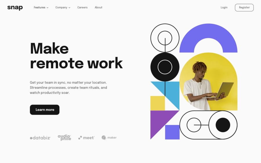
<img src="image-hero-mobile.png" alt="A man typing into a laptop" />
</picture>
</div>
If you are using a desktop first approach and then using a media query for mobile view, then just switch the images around. Basically you'd want the img image to be the view that you're writing your base CSS for without media query.
About the layout and alignment for the desktop view, have you tried using 2 columns instead of 3 in the grid? I think that's what I'd try instead, and then use the minmax on the image mainly since I think that size kind of determines the spacing and width of the other side. I'd also put in either a max-width or something like width: min(90%, 80rem) on the home grid container to keep it from being so close to the sides, and then you may need a margin-inline: auto to center it as well. For your mobile view, I'd just use a 1fr for your column instead of any minmax.
I also completed this project but I did mine in React and I used only flexbox, although I'd really love to try this again in just JS plus grid. Anyway, great job once again, and good luck!
Marked as helpful
