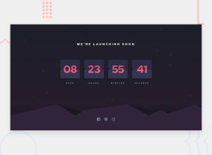
Design comparison
SolutionDesign
Solution retrospective
I would like to know more about the following:
- Did I position background-images correctly? And If I did not, how do I improve?
- How do I style the middle horizontal line on each of the number cards? Should I use separate <div> elements and style them in css, or maybe use pseudo elements on them and also, how do I do that? Any suggestions are welcome! Thank you!
Community feedback
Please log in to post a comment
Log in with GitHubJoin our Discord community
Join thousands of Frontend Mentor community members taking the challenges, sharing resources, helping each other, and chatting about all things front-end!
Join our Discord
