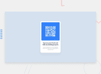
Design comparison
Solution retrospective
I was actually able to accomplish more than I expected without having to consult tutorials to review layout. As far as I can tell, the CSS is pretty minimal and I imagine it would be hard to argue that this is being accomplished in any sort of a hacky way.
What challenges did you encounter, and how did you overcome them?Center elements vertically because I couldn't remember how flex-box worked. Additionally, I struggled with making the layout respond to screen-sizes properly because I was initially using a max-width property to constrain the size of the image.
What specific areas of your project would you like help with?There are a lot of pixel units declared in the CSS and I'm not sure that's the proper way to do things. I stuck with pixels because it was the easiest way to match the presented design as closely as possible, but I'm curious if others are able to accomplish the same with less rigid measurement units.
Community feedback
- @LuisVera1Posted 7 months ago
Hi @MikeCook9994
Your solution looks great! however, here are some suggestions.
--- Css
- Variables must be defined in the
:rootelement. - Use rem to set
font-size. - You could use classes instead of applying styles directly to elements.
Check out the following link: Qr-component
Hope this is helpful, if it is, don't forget to mark it, thank you
Keep up the good work!
0 - Variables must be defined in the
- @Nasserio10Posted 7 months ago
Peer Review used diiferent element that i didnot know like <section> and <nav> , generally my code get same result with him but his look more professional.
0
Please log in to post a comment
Log in with GitHubJoin our Discord community
Join thousands of Frontend Mentor community members taking the challenges, sharing resources, helping each other, and chatting about all things front-end!
Join our Discord

