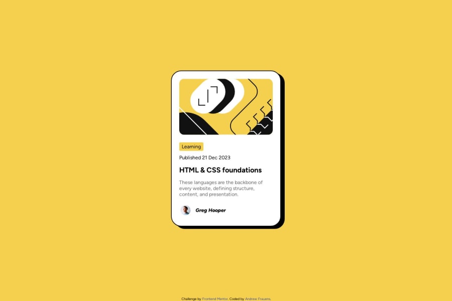
Design comparison
SolutionDesign
Solution retrospective
What are you most proud of, and what would you do differently next time?
I think I generally structured things better than the previous task.
So far I only implemented the mobile view because I'm curious what the system does if I don't handle everything quite right.
What challenges did you encounter, and how did you overcome them?the img tag being too big was annoying. Also mixed up href vs src a couple times.
What specific areas of your project would you like help with?Any thoughts on making it more accessible would be good since I don't know much about that.
Join our Discord community
Join thousands of Frontend Mentor community members taking the challenges, sharing resources, helping each other, and chatting about all things front-end!
Join our Discord
