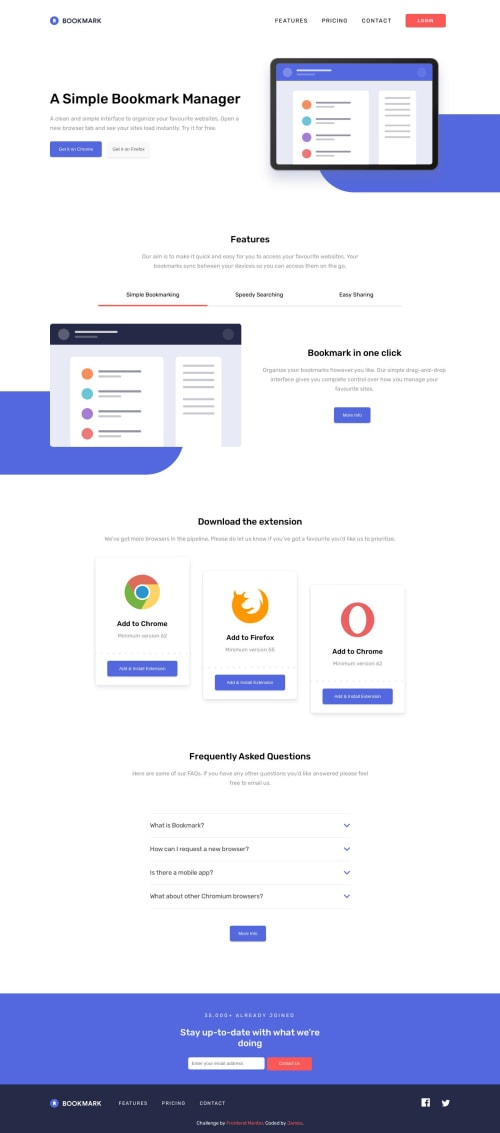
Submitted about 2 years agoA solution to the Bookmark landing page challenge
Vanilla HTML, CSS, JS solution
@christiano84

Solution retrospective
This was done in vanilla HTML, CSS and Javascript. If I had to do it all over again I would do it in a framework like React and use something like Tailwind to speed up the whole process.
I could use advice on the mobile menu. I feel like there is a better way to accomplish it programatically in JS or React.
Code
Loading...
Please log in to post a comment
Log in with GitHubCommunity feedback
No feedback yet. Be the first to give feedback on christiano84's solution.
Join our Discord community
Join thousands of Frontend Mentor community members taking the challenges, sharing resources, helping each other, and chatting about all things front-end!
Join our Discord