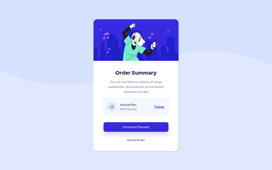
Design comparison
Solution retrospective
Hi all,
All feedback welcome :) Thanks so much!
Community feedback
- @alihuseynzade23Posted almost 3 years ago
Hi Ahmed! Well done.
-My only recomendation will be to use use "a" tag, not the "button" tag for the buttons. Because if you will create real sites(I hope you will), these buttons will have to redirect to another page and the tag "a" is best for it.
Marked as helpful3@shrki416Posted almost 3 years ago@AleksHNZ awesome, hadn't considered that. Will make that change :)
0 - @brodiewebdtPosted almost 3 years ago
Nice job. This is well done. @AleksHNZ is right about the a tag. I give them a class of .btn and other classes for styling multiple buttons (btn-primary, btn-secondary, btn-ghost, etc.)
Marked as helpful1@shrki416Posted almost 3 years ago@brodiewebdt Thank you! This is a great idea. I'll make those changes.
0
Please log in to post a comment
Log in with GitHubJoin our Discord community
Join thousands of Frontend Mentor community members taking the challenges, sharing resources, helping each other, and chatting about all things front-end!
Join our Discord
