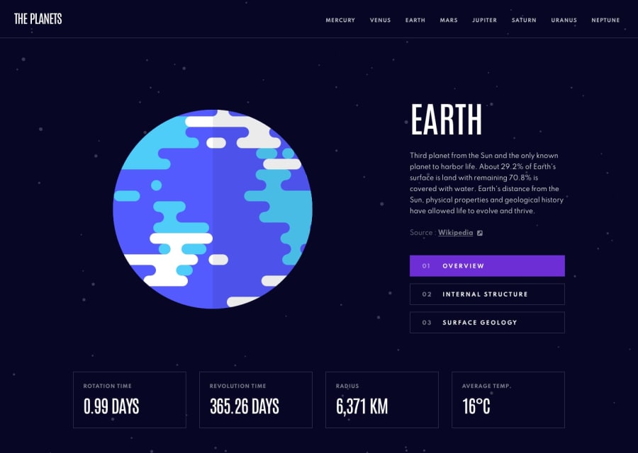
Vanilla HTML, CSS and JS. Data is rendered dynamically.
Design comparison
Solution retrospective
Any feedbacks are welcome! Thanks
Community feedback
- @seanred360Posted over 3 years ago
Very nice job! I think you got the design even closer than I managed to. I could not find any bugs or sizing issues. The only thing you could improve is make the
<p id="main-description">have a fixed size. That way when you change the text, the 'overview', 'internal', 'geology' buttons do not move around. Also look above my comment, it says you have some accessibility issues and HTML validation issues. Those are super easy to fix and it will explain the problem in detail. Typically I will use an HTML validator after I finish to check for errors I made when I moved things around.Marked as helpful1@leaninghowtousegitPosted over 3 years ago@seanred360 Thanks for the feedback Sean! Great idea, will implement the
<p id="main-description">. Will be fixing the accessibility issues and HTML validation issues in the near future too. Thanks for the time invested! Wish you the best.0
Please log in to post a comment
Log in with GitHubJoin our Discord community
Join thousands of Frontend Mentor community members taking the challenges, sharing resources, helping each other, and chatting about all things front-end!
Join our Discord

