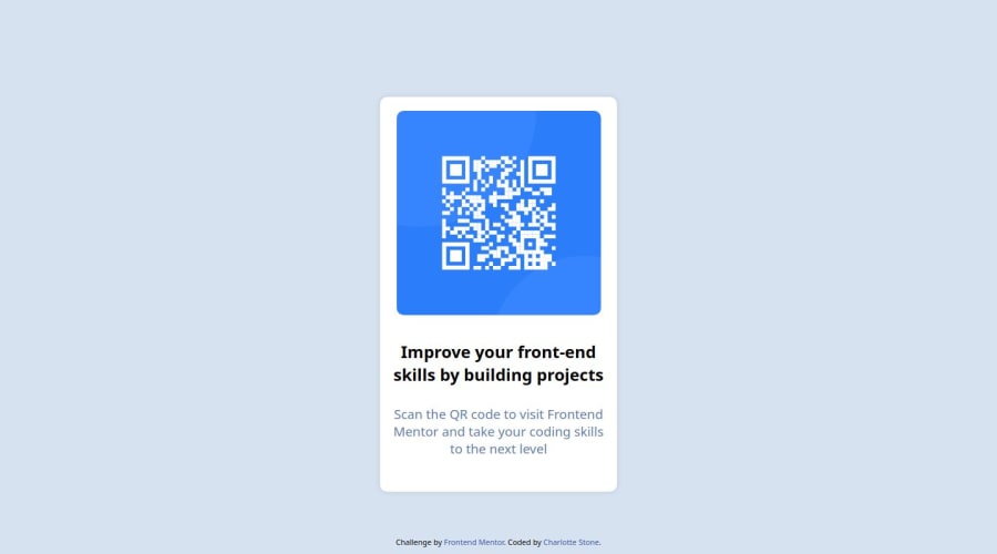
Design comparison
Solution retrospective
I chose to stick with purely vanilla HTML and CSS rather than depending on style frameworks like Bootstrap and such.
What challenges did you encounter, and how did you overcome them?I didn't have access to Figma for this challenge as I was on my Linux machine so I was only going by the picture for the challenge and think I managed to do fairly well.
What specific areas of your project would you like help with?I'm happy with how the project turned out. I'm always happy to receive feedback, however there is nothing that stands out to me at the time of writing.
Community feedback
- @danielmrz-devPosted 4 months ago
Hello there!
Congrats on completing the challenge! ✅
Your solution looks great!
I have a suggestion for improvement:
📌 Think about using
<main>
to wrap your main content instead of<div>
.Imagine
<div>
and<span>
in HTML as basic containers. They're good for holding stuff, but they don't tell us much about what's inside or its purpose on the webpage.This change might not have impact on how your page looks, but it'll make your HTML code clearer and help with SEO and accessibility.
Hope that's helpful!
Keep up the great work!
Marked as helpful2@TeraforaPosted 4 months ago@danielmrz-dev Thank you Daniel, I completely forgot about semantic HTML 😅 I'll be endeavouring to use it rather than the plain the tags I used in this project.
Thank you for offering your time and feedback 😊
1 - @Islandstone89Posted 4 months ago
HTML:
-
Every webpage needs a
<main>
that wraps all of the content, except for<header>
andfooter>
. This is vital for accessibility, as it helps screen readers identify a page's "main" section. Wrap the card in a<main>
. -
It's best practice to use classes instead of IDs.
-
The alt text must also say where it leads(the frontendmentor website). A good alt text would be "QR code leading to the Frontend Mentor website."
-
.attribution
should be a<footer>
, and you should use<p>
for the text inside.
CSS:
-
Including a CSS Reset at the top is good practice.
-
I like to add
1rem
ofpadding
on thebody
, to ensure the card doesn't touch the edges on small screens. -
Add
flex-direction: column
andgap: 2rem
onbody
. -
On the
body
, changeheight
tomin-height
- this way, the content will not get cut off if it grows beneath the viewport. -
Remove the margin on the card, it is not needed. You don't need the
flex
properties either. -
Remove all widths and heights in
px
. Setting fixed dimensions prevents components from adapting to different screen sizes. -
Add a
max-width
of around20rem
on the card, to prevent it from getting too wide on larger screens. -
font-size
must never be in px. This is a big accessibility issue, as it prevents the font size from scaling with the user's default setting in the browser. Use rem instead. -
Since all of the text should be centered, you only need to set
text-align: center
on the body, and remove it elsewhere. The children will inherit the value. -
Change
font-family: "Outfit", sans-serif";
tofont-family: "Outfit", sans-serif;
. -
You can remove the flex properties on the card text, as they are not needed.
-
I would remove
position: absolute
andmargin-top
on the<footer>
. -
Add
max-width: 100%
on the image - without this, it will overflow its container if the image size is larger than the container size. -
I would have the same padding on all sides of the card:
padding: 16px;
.
0 -
Please log in to post a comment
Log in with GitHubJoin our Discord community
Join thousands of Frontend Mentor community members taking the challenges, sharing resources, helping each other, and chatting about all things front-end!
Join our Discord