Submitted over 2 years ago
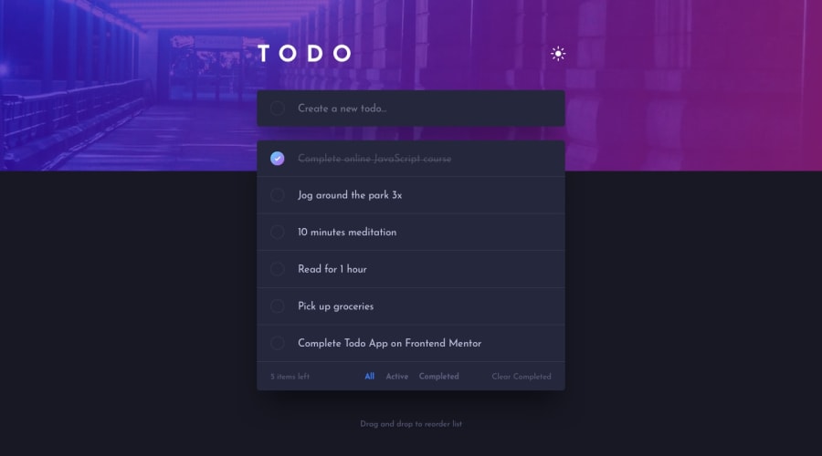
TODO App with React JS, Framer Motion, and vanilla CSS
@hectorgarcia07
Design comparison
SolutionDesign
Community feedback
- @denieldenPosted over 2 years ago
Hi Hector, great work on this challenge! 😉
Here are a few tips for improve your code:
- add
maintag and wrap the card for improve the Accessibility - to make it look as close to the design as possible add
outline: 0to.input-noteclass to remove the blue line offocusstate - add
transitionwhen the user change dark/light mode - instead of using
pxuse relative units of measurement likerem-> read here buttonmust have discernible text, you can add text with csshiddenproperty- i can add task also with blanks, add a control... The
trim()method can help you -> read here
Overall you did well 😁 Hope this help!
1@hectorgarcia07Posted over 2 years ago@denielden Thank you very much for the feedback!
1 - add
Please log in to post a comment
Log in with GitHubJoin our Discord community
Join thousands of Frontend Mentor community members taking the challenges, sharing resources, helping each other, and chatting about all things front-end!
Join our Discord
