


@correlucas
Posted
👾 Hello Chris, congratulations for your solution!
I saw that you've done a good work in this challenge, you paid attention to the details, the card component is responsive, the element design match. Well done!
Your solution is almost perfect, I've only two tips for you:
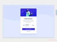
1.👾This challenge has two background images, mobile and desktop version background images.You can add a media query to switch between background-images when the screen gets the mobile size. I wrote the code for the media query in your solution, the image will change after the window reach width 500px. See the code below:
@media (max-width: 500px) {.home-wrapper { background-image: url(./images/pattern-background-mobile.svg);}}
2.👾Note that your section called .card-summary-plan is having a strange behavior when the screens get stretched and get smaller, the content start to pop up out the container, fix this using flex-wrap: wrap; to get the element in different rows when the card component contract or use a media query changing the flex-direction to have the element in rows to save space:
.card-summary-plan { flex-wrap: wrap; }
@media (max-width: 500px) {.card-summary-plan { flex-direction: column;;}}
Hope it helps you and happy coding!
Marked as helpful
@ChrisAndrewsDev
Posted
@correlucas Oh wow I don't know how I missed that second image! 😲 I will go ahead and add that in, I was hoping to avoid a media query if I could on this one..
Thanks for the code snippets also! I will go ahead and implement them and test! 😊
@correlucas
Posted
@ChrisAndrewsDev You're welcome Chris. You don't need a media query, you can do this using <picture> and add both images inside the tag, but I think is much simple just add the media query than touch again the html code. Happy to hear that my comment was useful. Happy coding!😊
