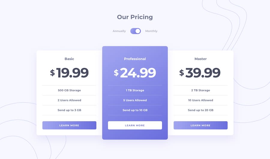
Design comparison
SolutionDesign
Solution retrospective
When toggling, as the price adds an extra decimal point the whole container is increased in size, pretty bad UI design there.. any tips on how to stop this would be great. cheers
Community feedback
Please log in to post a comment
Log in with GitHubJoin our Discord community
Join thousands of Frontend Mentor community members taking the challenges, sharing resources, helping each other, and chatting about all things front-end!
Join our Discord
