Design comparison
SolutionDesign
Solution retrospective
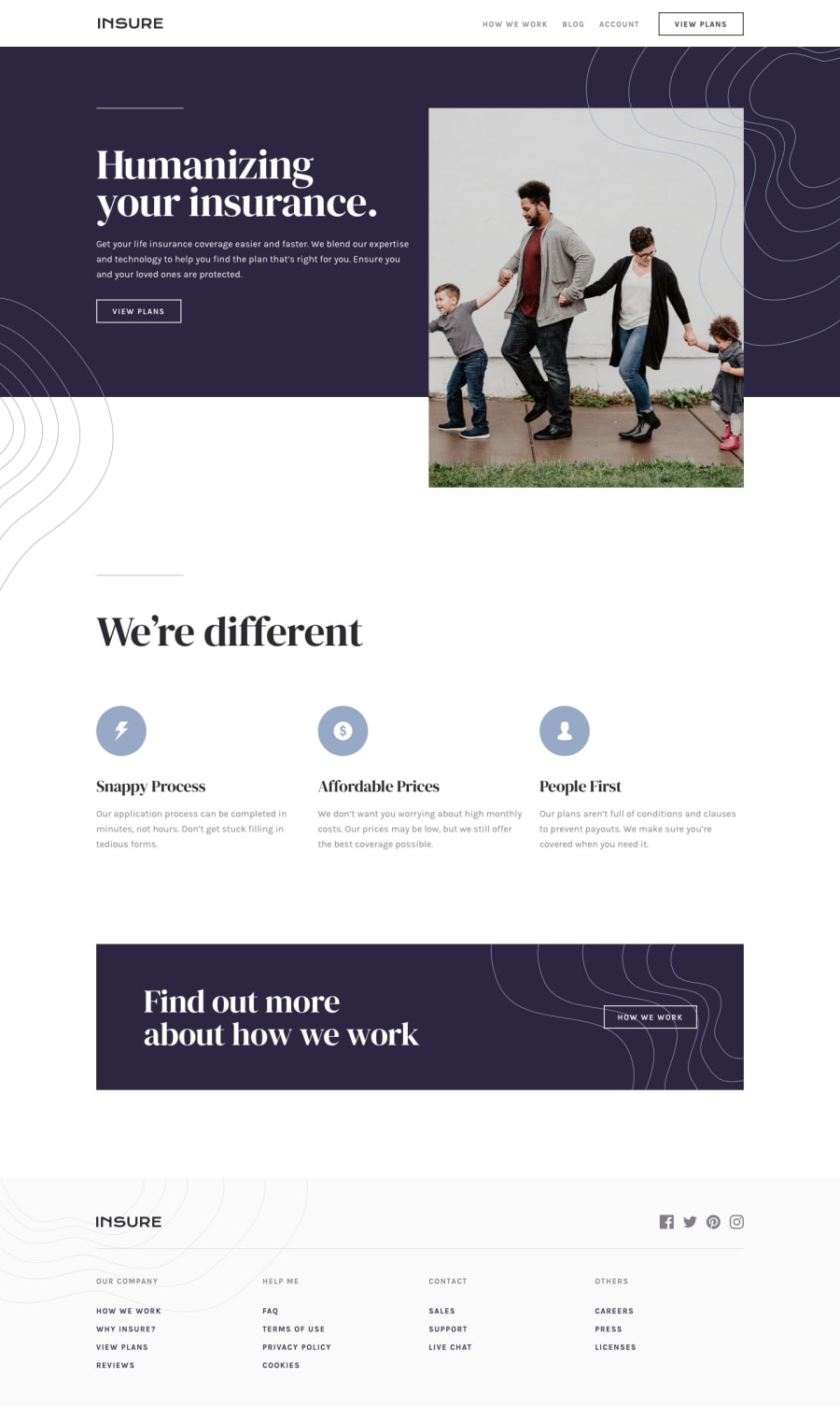
I'm mostly happy with this, but getting the full width background sections while maintaining the grid was a challenge, and I don't think I found the best solution for that. I'll be interested to see how other people approached that.
Also, positioning the curvy background patterns, I'm 100% sure I didn't do that in the right way, but I couldn't figure out a better option for them.
Maybe instead of having a 12 column grid, within a margin, I should have tried a 14 column grid where the first and last columns are the main page margins.
Community feedback
Please log in to post a comment
Log in with GitHubJoin our Discord community
Join thousands of Frontend Mentor community members taking the challenges, sharing resources, helping each other, and chatting about all things front-end!
Join our Discord
